Matt Hobbs Head of Frontend, Lead Developer Government Digital Service @TheRealNooshu Hello everyone! First a thank you to the Andy, Andrew and Simon for allowing me to speak tonight. I’m Matt Hobbs, and I work for the UK Government Digital Service as Head of Frontend. As well as frontend I also have a keen interest in web performance optiminsation. But today I’m not here to talk to you about the wonderful world of UK Government services (I’m sure you’re all disappointed) I’m here to talk to you about a tool you may, (or may not) have heard of…
Slide 1
Slide 2

..and that is WebPageTest.
Slide 3

How to Read a WebPageTest waterfall chart This talk is mainly about a very specific part of WebPageTest….
Slide 4
And that is the waterfall chart. Now the chart may look intimidating at first, but once you understand it, the visualisation really unlocks a heap of information for you at a glance. Allowing you to: ● Quickly debug issues ● Certify that issues are fixed ● Understand how exactly a browser loads the page
Slide 5

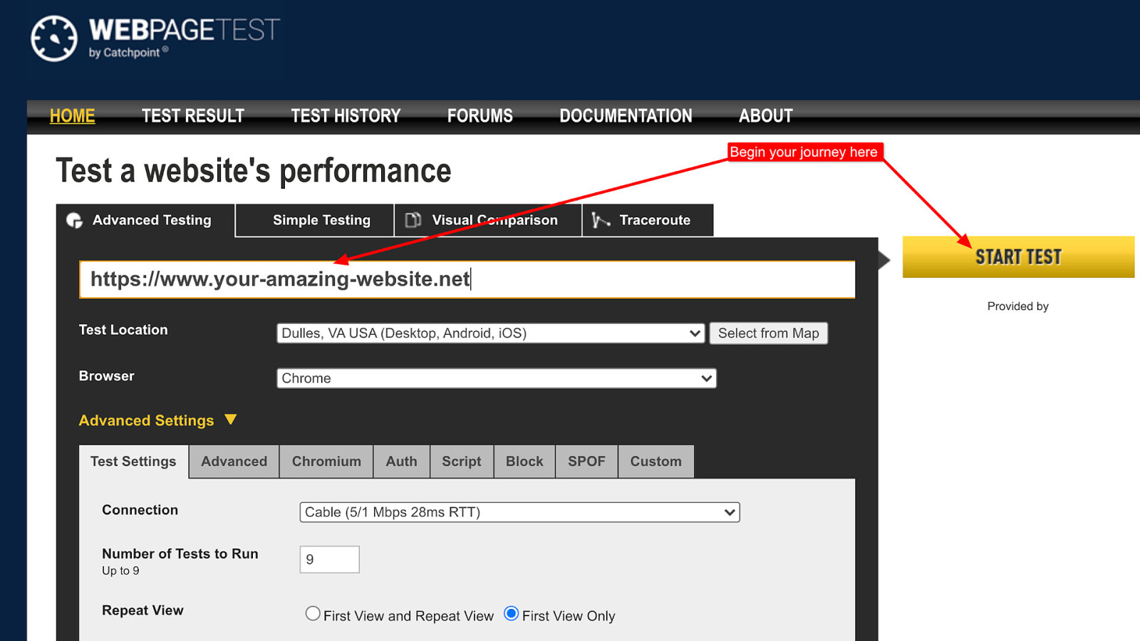
Assumed knowledge There are a couple of bits of assumed knowledge for this talk… First is the WebPageTest URL. For those unsure…
Slide 6

https://www.webpagetest.org/ It’s https://www.webpagetest.org/. This will bring you to the the public instance of WebPageTest where you can test your sites performance for free.
Slide 7
Second is that you have run a test. Don’t worry though, if you haven’t run one I just so happen to have a whole blog post all about it here….
Slide 8

https://t.ly/Ys4v Shameless plug I know!
Slide 9

What is WebPageTest? So first let’s cover a little background info. What is WebPageTest?
Slide 10
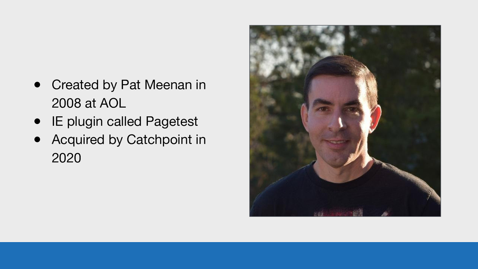
● Created by Pat Meenan in 2008 at AOL ● IE plugin called Pagetest ● Acquired by Catchpoint in 2020 GDS WebPageTest is a synthetic performance testing tool created by Pat Meenan in 2008 while he was at working at AOL. It was originally an IE plugin called Pagetest, before evolving into the online version we see today. WebPageTest was recently acquired by Catchpoint in 2020. Pat, along with the rest of the Catchpoint team will help maintain and grow it in the future.
Slide 11
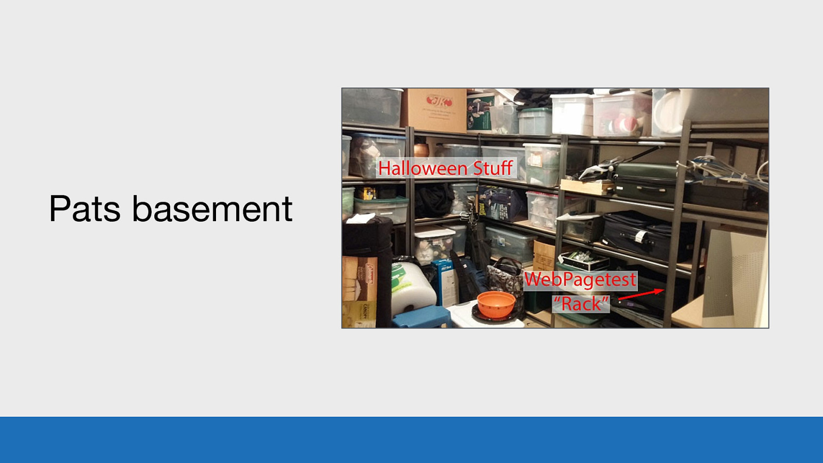
Pats basement GDS But for the past 13 years, the public instance of WebPageTest (including all the test devices) have been sitting in Pats basement. This image is from 2014, I assume it may have changed a little in 6 years.
Slide 12
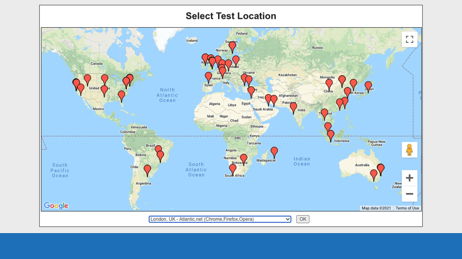
GDS WebPageTest allows you to run web performance tests from any of these locations in the world. You can configure the test agents to test your site using a whole host of browsers with many different connection speeds. The data you get back from the tool is invaluable for spotting and fixing web performance issues.
Slide 13

Basics Enough of the history of WebPageTest. Let’s dive right in to the waterfall chart UI.
Slide 14
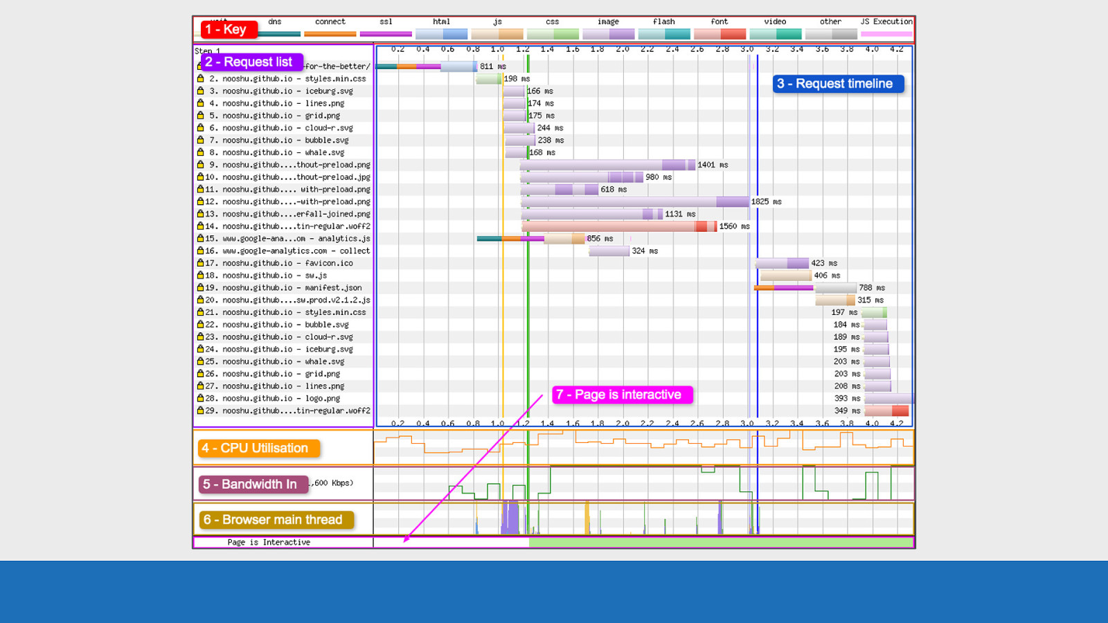
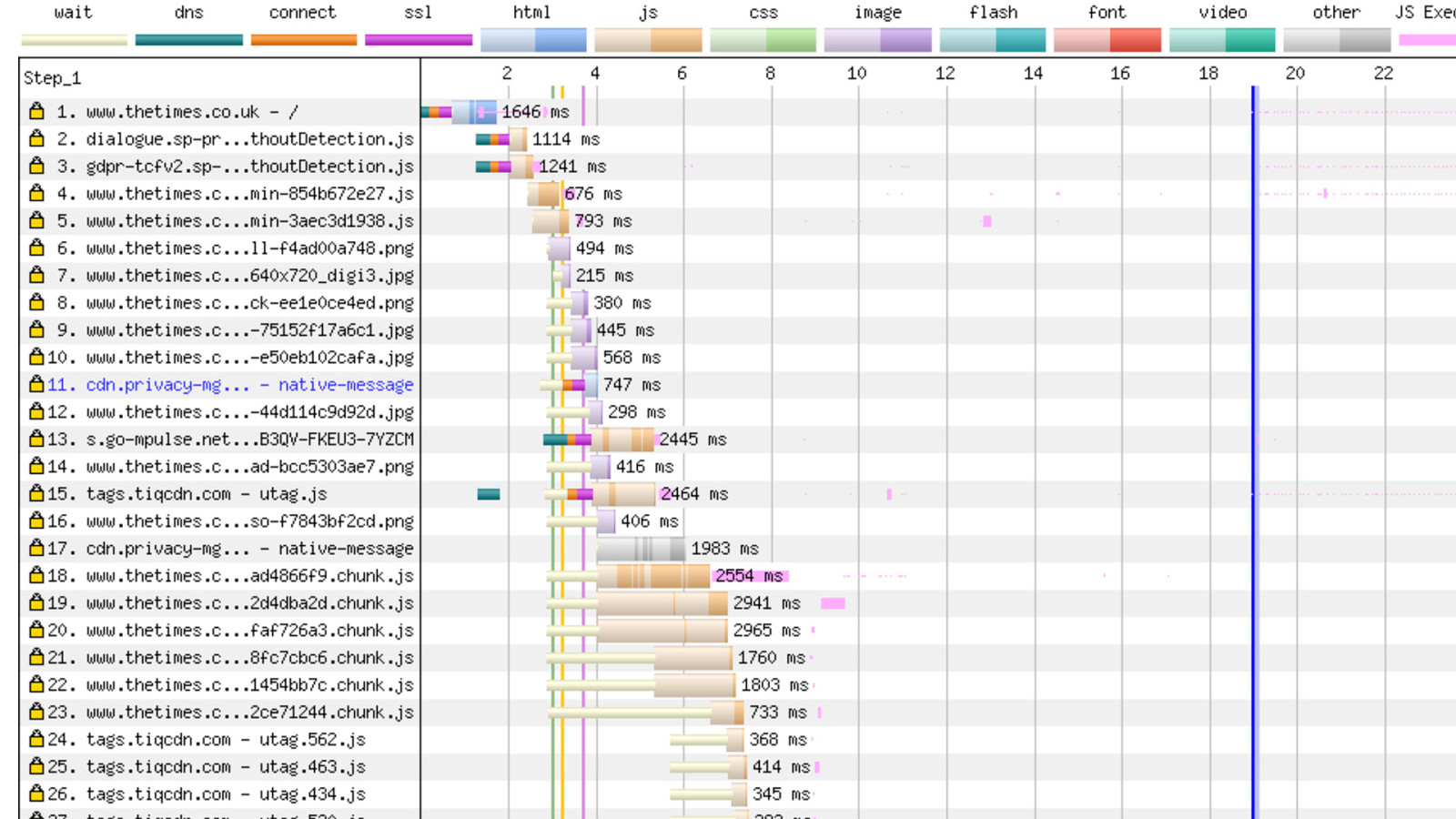
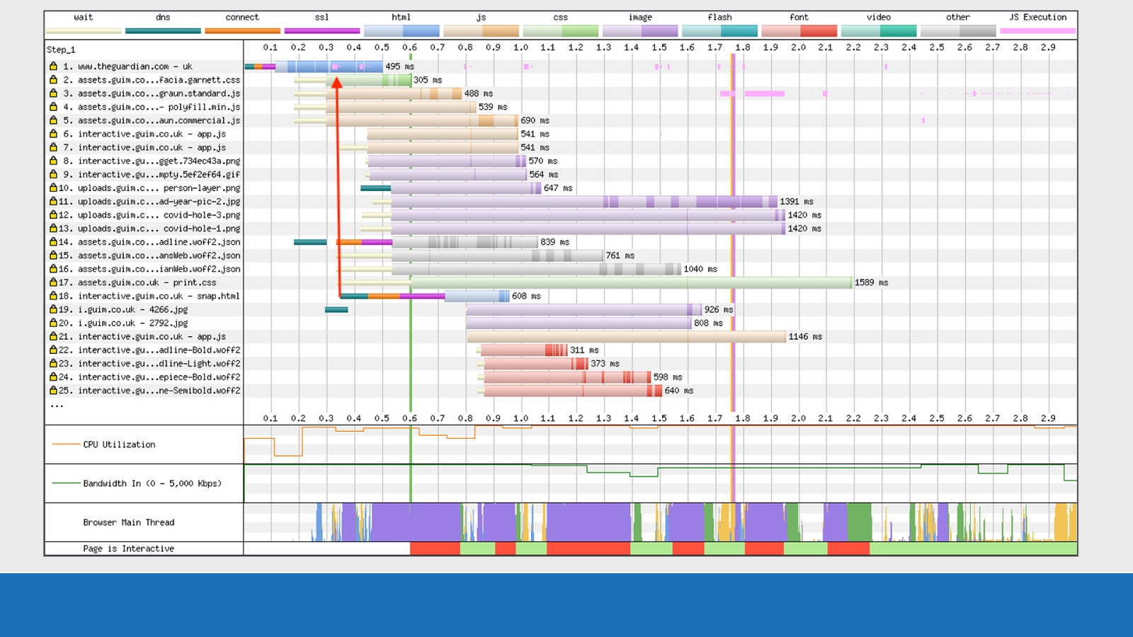
GDS Here’s a basic WebPageTest waterfall chart. The test is from my own blog This chart is essentially a visualisation of the raw data you get back from various browser API’s. I’ve split this image into 7 sections. I’ll go over each very briefly…
Slide 15

1: Key Number 1: The key
Slide 16
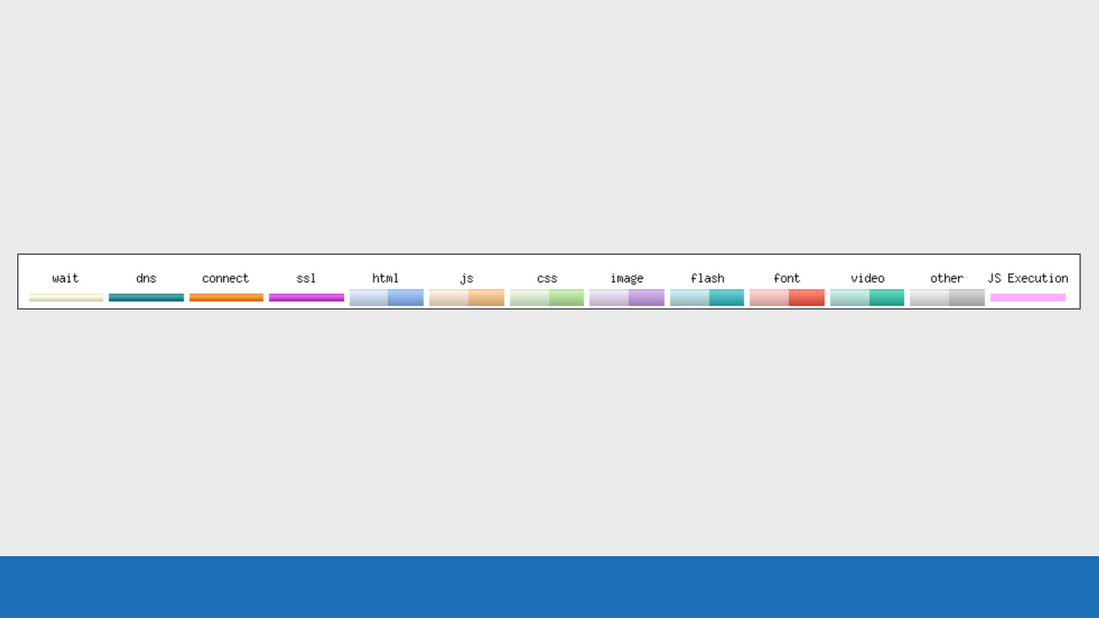
GDS ● Here we see a series of colours. ○ First a set of browser / connection events (wait, dns, connect, ssl etc) ○ Next as set of colour coded files by their mime-type. You’ll see two colour tones for each, I’ll come onto what this means later ○ Last in pink to the right the JavaScript execution time Each of these colours corresponds to an event or request you will see on the request timeline.
Slide 17

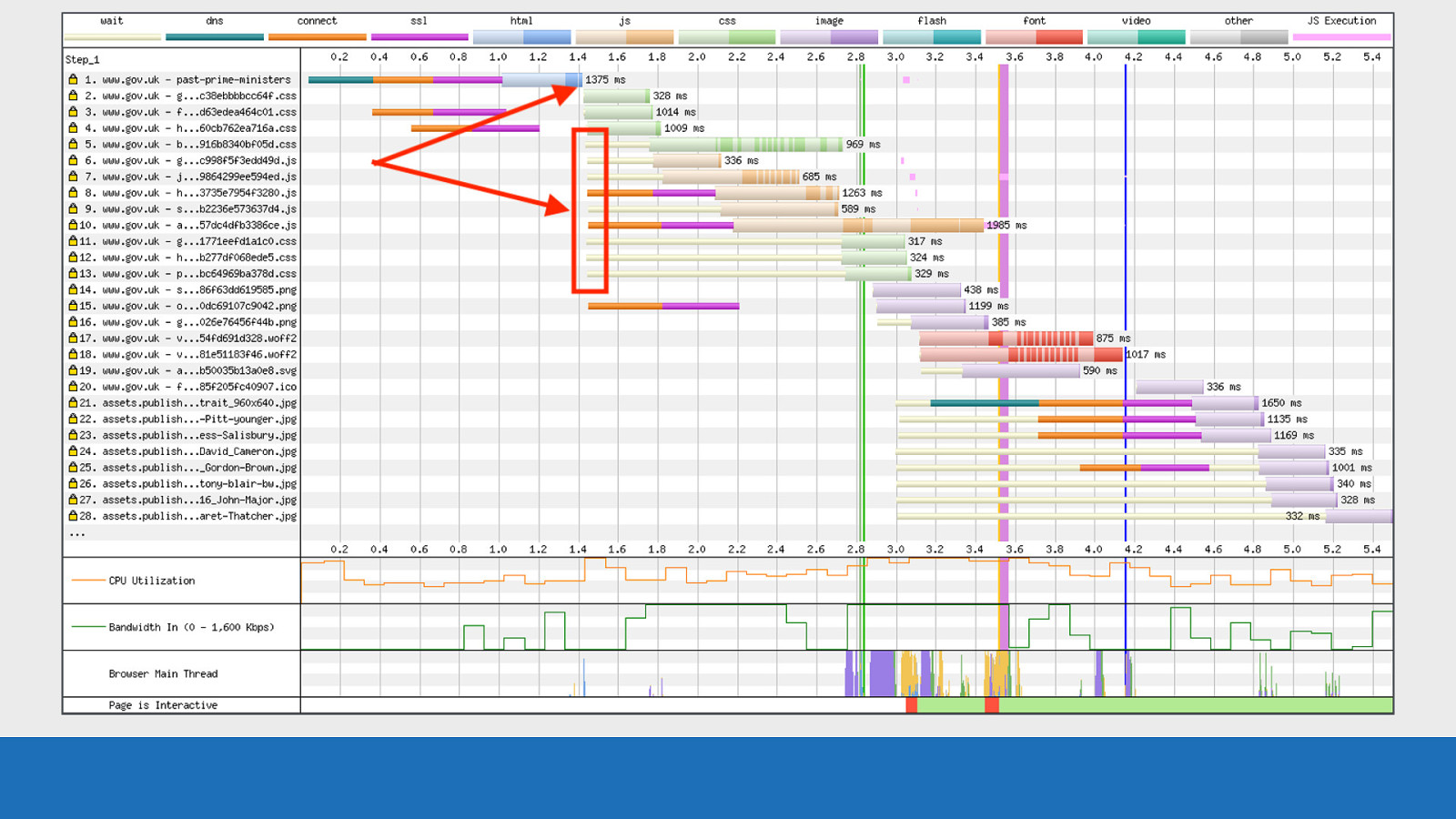
2: Request List Number 2: The request list
Slide 18
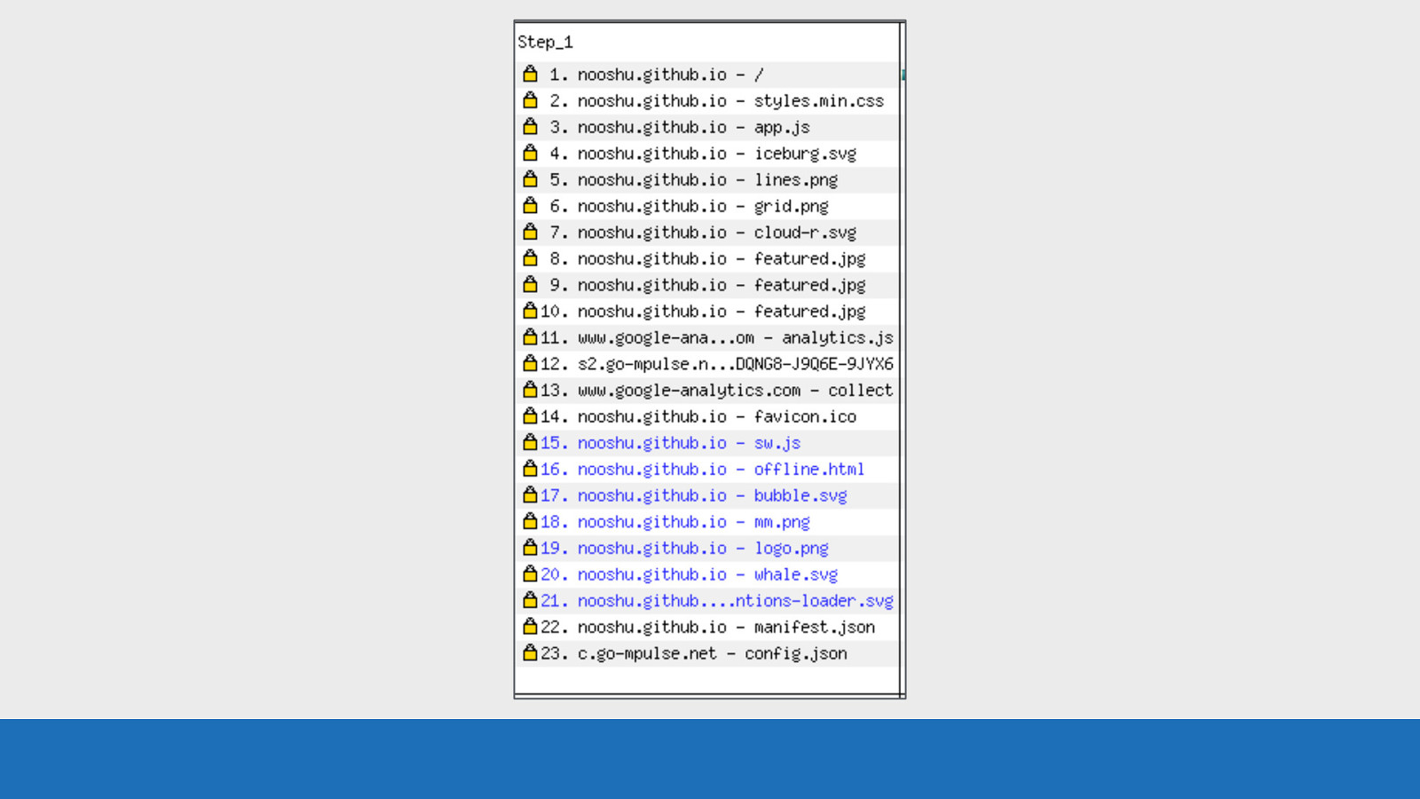
GDS Here we see the list of assets found on this particular page. They are in the order the requests go out over the network. The HTML in this instance is at request number 1 at the top. ● But that isn’t always the case. Redirects and OCSP lookups can sometimes come before the page HTML.
Slide 19
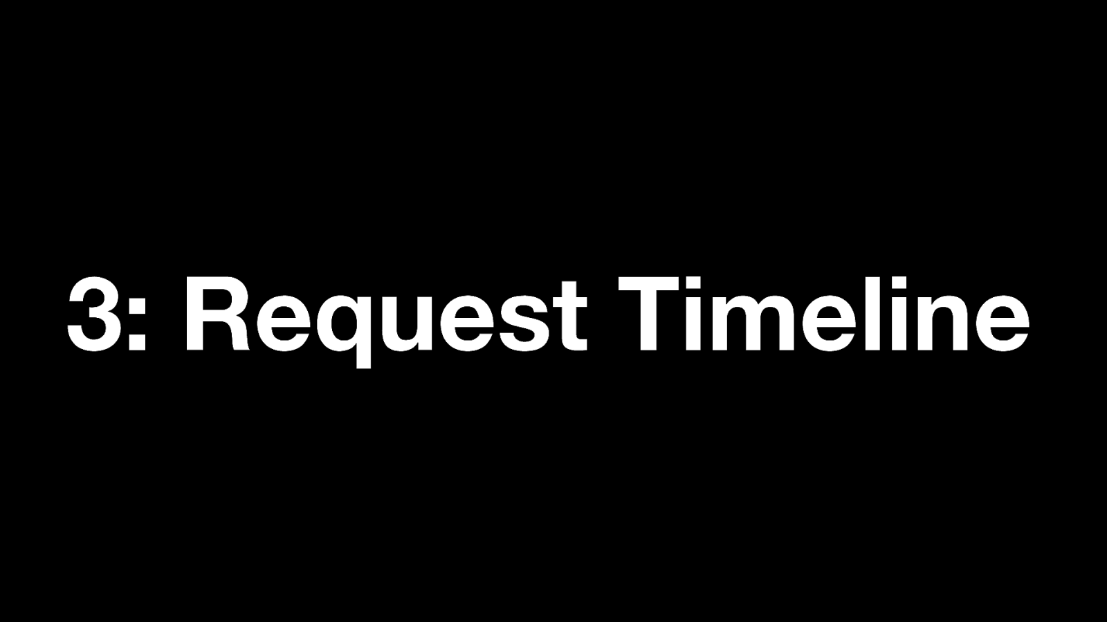
3: Request Timeline Number 3: The request timeline
Slide 20
GDS Here we see the waterfall. It’s much like you would see in the network tab in your developer tools. The colour coding we saw earlier in the key applies here. Each asset is on its own separate row. The time in seconds is seen along the top and bottom of the image. This could also be in milliseconds for some tests. But there’s a whole lot more going on in this image that I will cover soon.
Slide 21
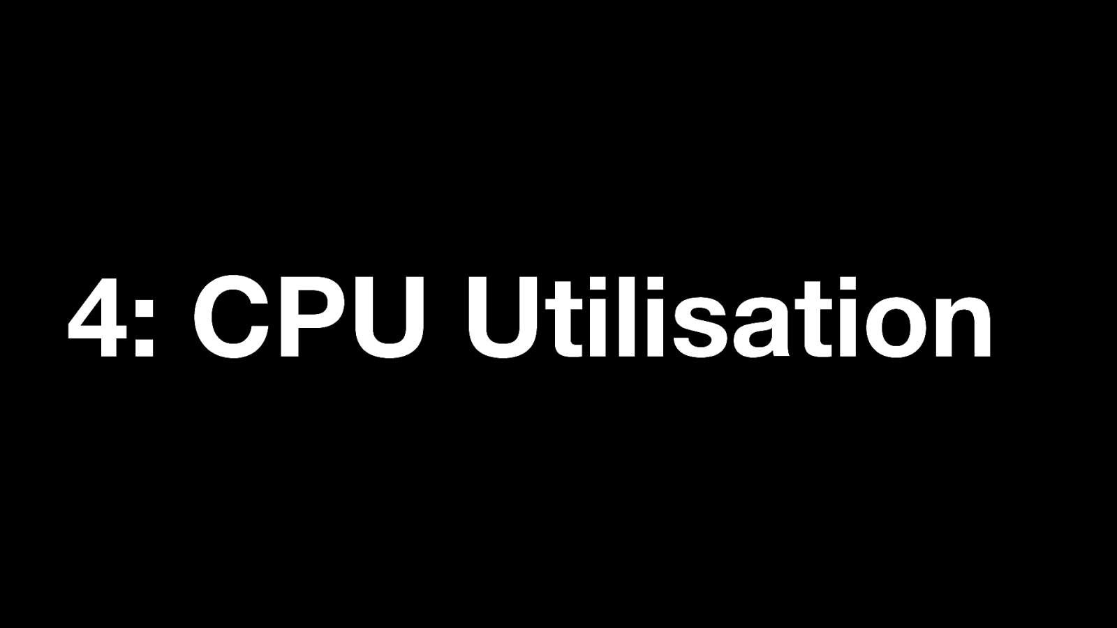
4: CPU Utilisation Number 4: CPU Utilisation
Slide 22
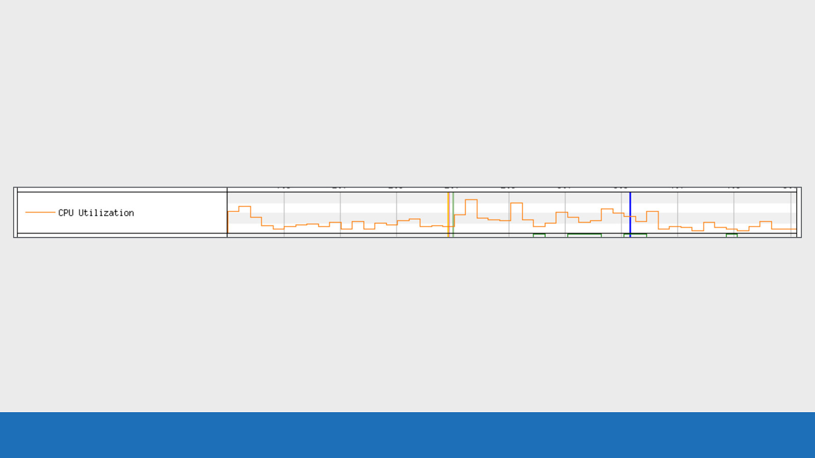
GDS Here we see a line graph of how much load the CPU of the test device was under at any point in time during the page load. It ranges from 0 to 100% utilisation. It’s always a good idea to keep an eye on this chart, especially on low spec devices. This is to see if the CPU is becoming a bottleneck for performance.
Slide 23

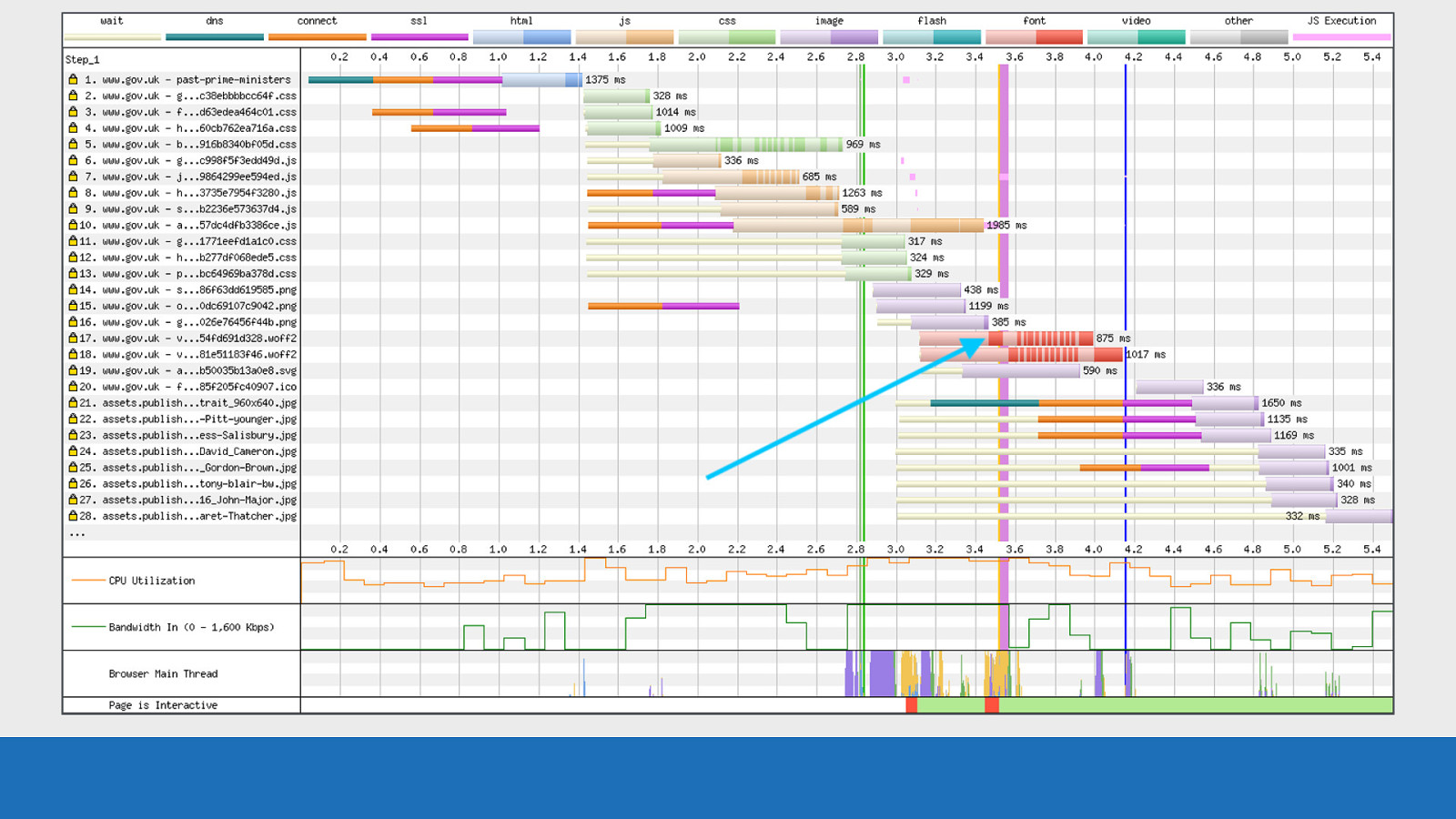
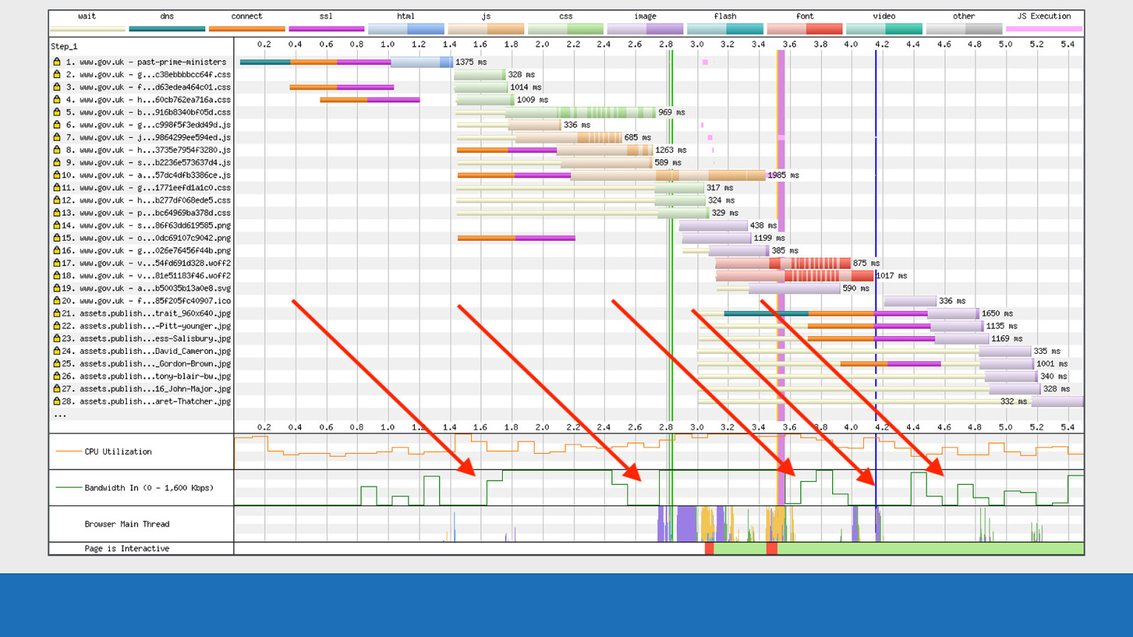
5: Bandwidth In Number 5: Bandwidth In
Slide 24
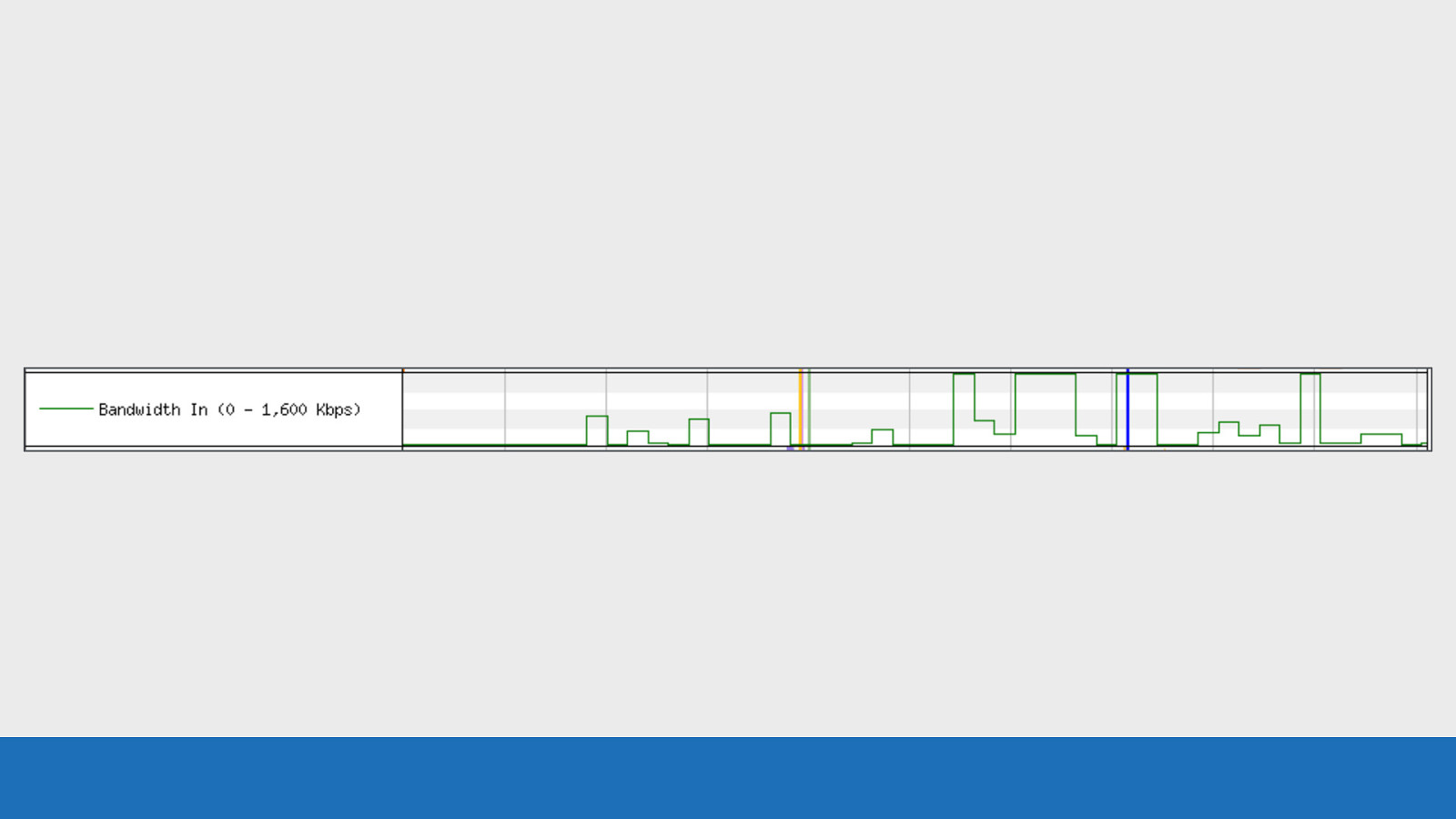
GDS This graph gives you an idea of the data flowing into the browser at any point in time during the page load. The absolute scale isn’t particularly accurate, but it’s roughly related to the max bandwidth allowed on the connection. In the example here the max bandwidth is 1,600 kilobits per second. This equates to a 3G connection. You mainly want to use this graph to check that the browser is doing useful work, rather time being wasted during the load. There’s a much more accurate option available called a ‘tcpdump’. This is located under the advanced settings tab when you configure the test. You should enable this if you want more accurate results that you can examine using tools like “Wireshark”.
Slide 25

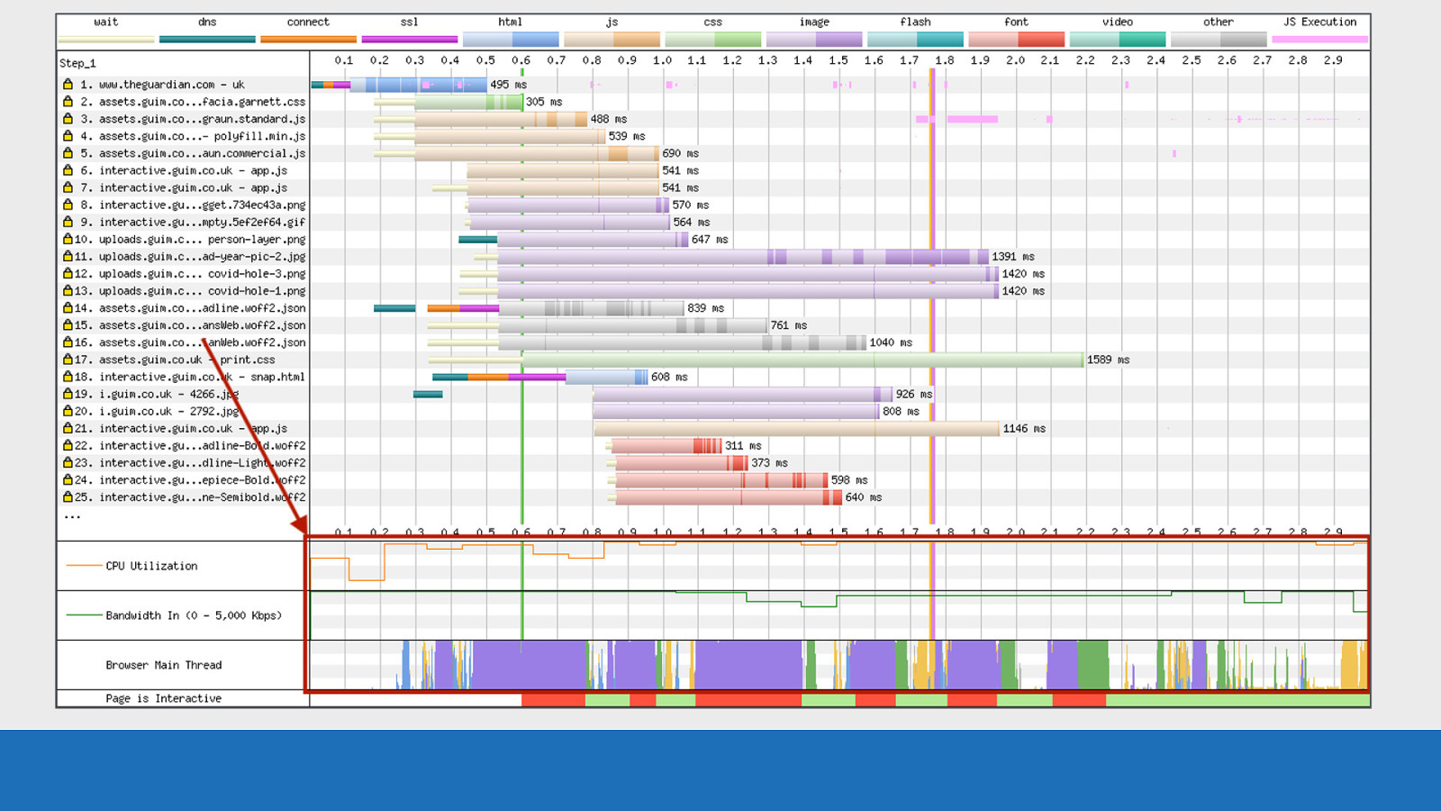
6: Browser Main Thread Number 6: Browser Main Thread
Slide 26
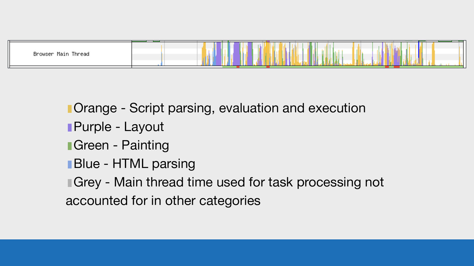
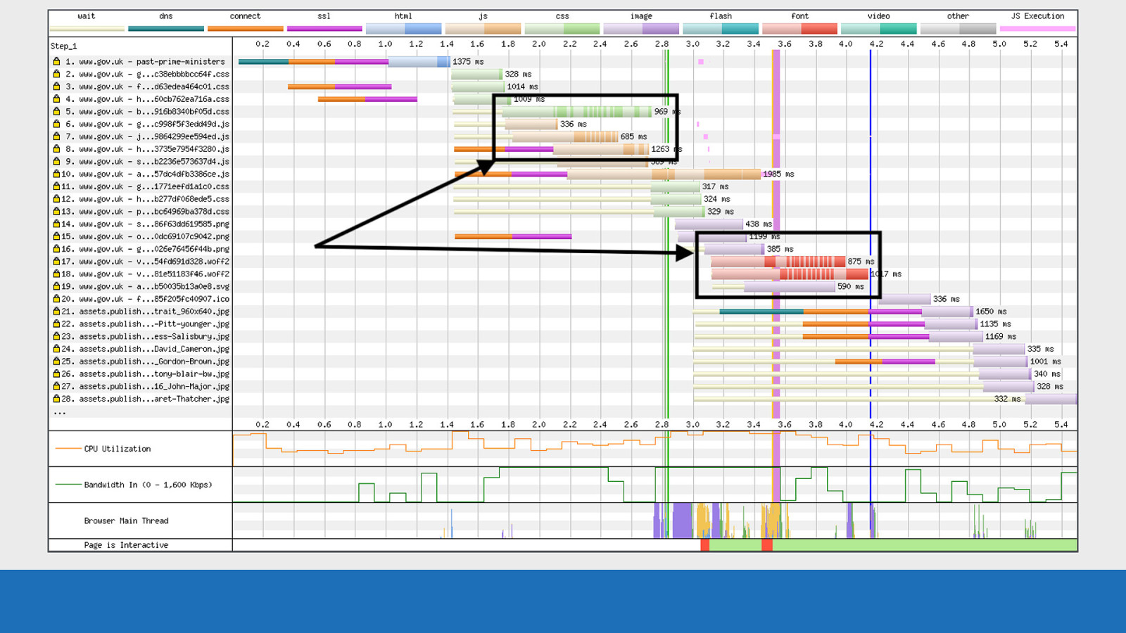
▮Orange - Script parsing, evaluation and execution ▮Purple - Layout ▮Green - Painting ▮Blue - HTML parsing ▮Grey - Main thread time used for task processing not accounted for in other categories GDS So this image isn’t taken from my blog, since it’s only a small static site, it’s nowhere near as busy as this. This is actually taken from one of the popular news websites here in the UK. Each of the colours corresponds to a particular task that the browsers main thread is doing at any point in time. The y-axis corresponds to the percentage of time that task is taking up. This graph is a great way to spot where the CPU is becoming a bottleneck and what task is causing it. NOTE: These colours may look familiar to you if you’ve used the ‘Performance’ tab in Chrome DevTools, as they are copied from there.
Slide 27
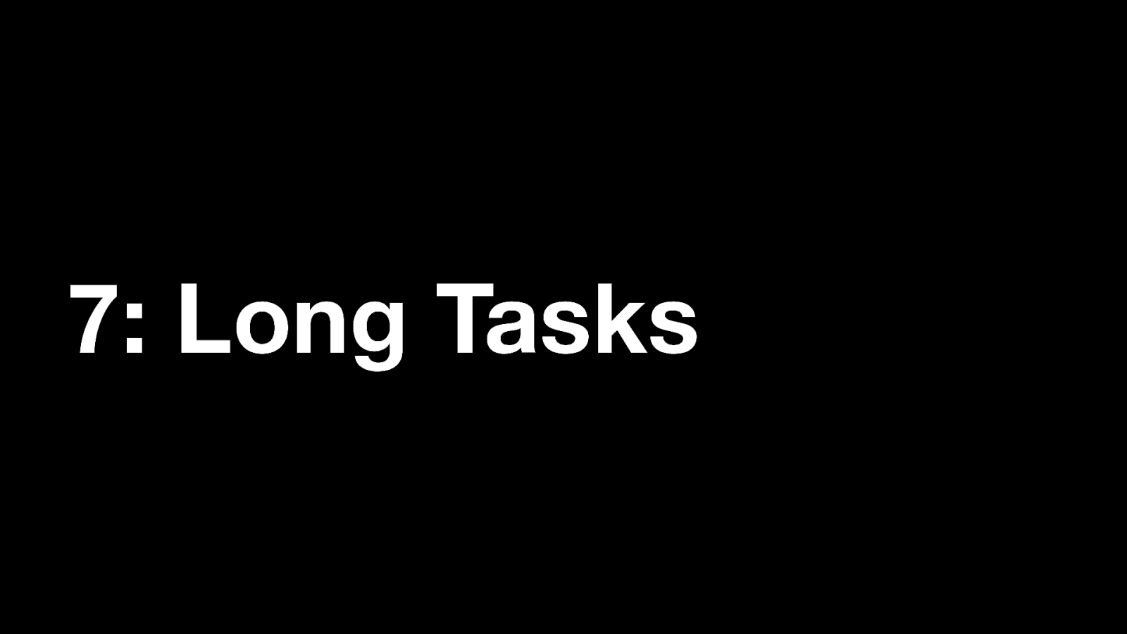
7: Long Tasks And last, Number 7: Long Tasks
Slide 28
GDS This thin bar gives you an indication of when the browser main thread is blocked. If the main thread is blocked for 50ms or more, the colour will be red. If not then it will be green. Note: a blocked thread may impact on inputs like button presses. But browser scrolling is likely to be unaffected as this is handled off the main thread.
Slide 29

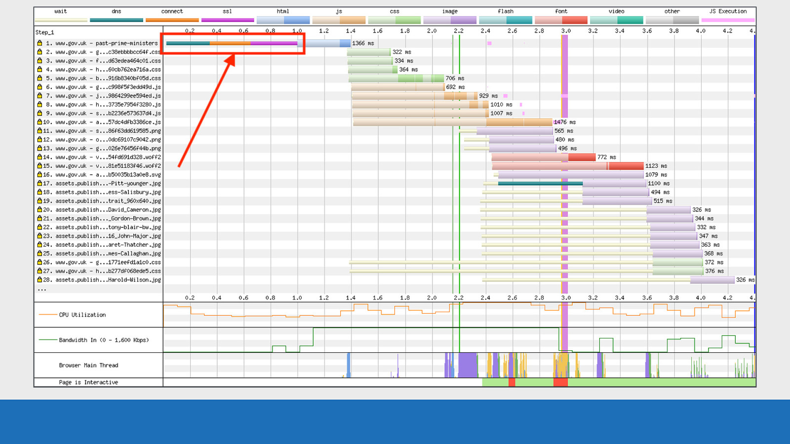
All together: So now if we pull this all together again…
Slide 30
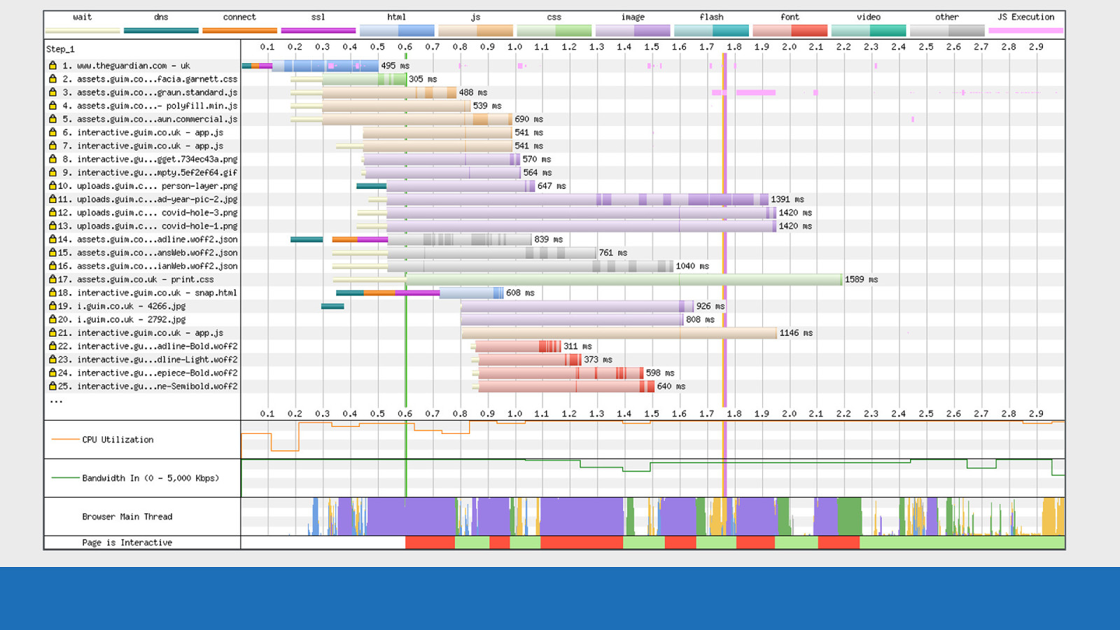
GDS …this UI hopefully now makes a little more sense. You can think of this graph as the story of how a browser has loaded a page. ● ● ● ● ● Chapter 1 - First connecting to a server, Chapter 2- the downloading and parsing of the HTML Chapter 3 - requesting the additional assets Chapter 4 - pixels rendered to the screen Final chapter - The story ends with the finalised page with all assets loaded. Let’s pull out some specifics for the waterfall you can see on the slide here. First let’s focus on request number 1…
Slide 31

GDS …we see a connection to the server
Slide 32

GDS The HTML being downloaded and parsed
Slide 33
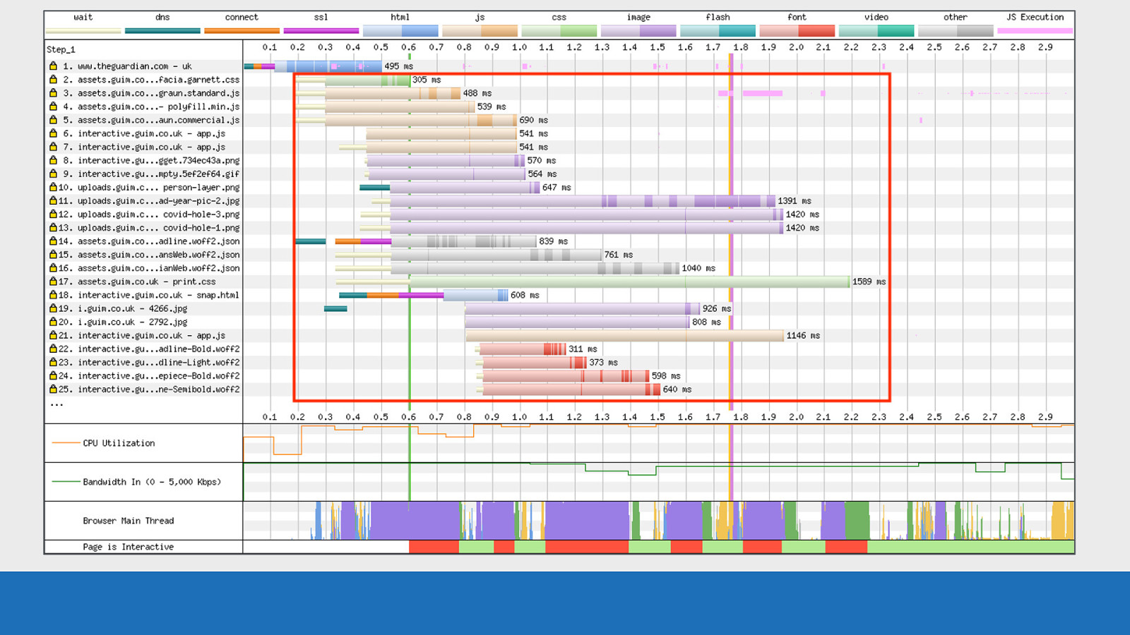
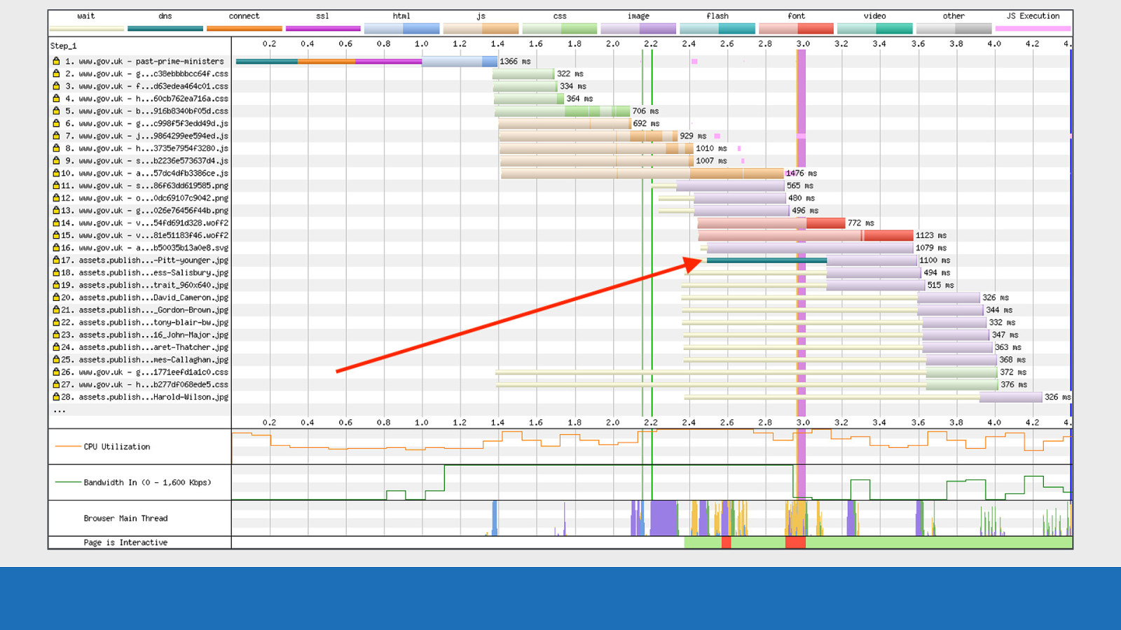
GDS Then additional page resources found and queued for later request
Slide 34

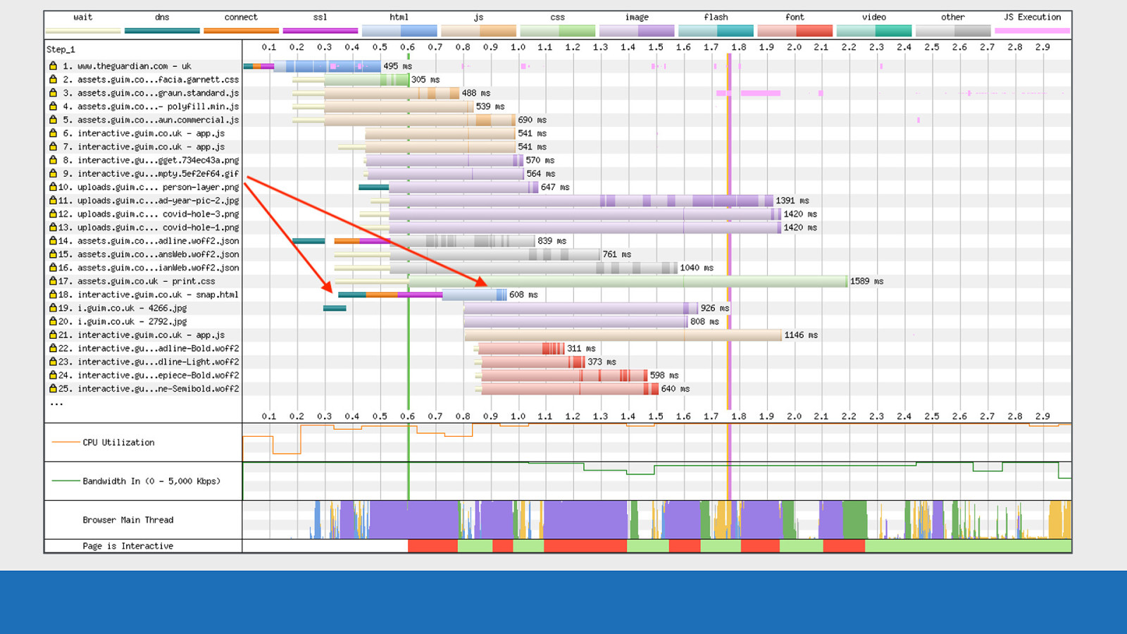
GDS Note the pink lines mixed with the blue asset colour of the HTML, this is JS execution happening during the HTML download and parsing phase. In other words: the HTML page has 2 large sections of inline JavaScript in the page source.
Slide 35

GDS In this test under HTTP/2 conditions, on request 14 we see an additional TCP connection established. This must be due to the asset requiring a CORS ‘anonymous’ connection, since this exact domain has already been used to download other assets on requests 2-5 using the connection already established on request number 1.
Slide 36
GDS Next request 18: Another TCP connection and the colour of the asset is blue. This is a request for another HTML page, most likely triggered by some JS execution.
Slide 37
GDS Now the reason why I say it was triggered by JS is because notice where the TCP connection starts. It lines up with the inline script execution within the HTML on request number 1. So there’s a very good chance that’s what initialised it.
Slide 38
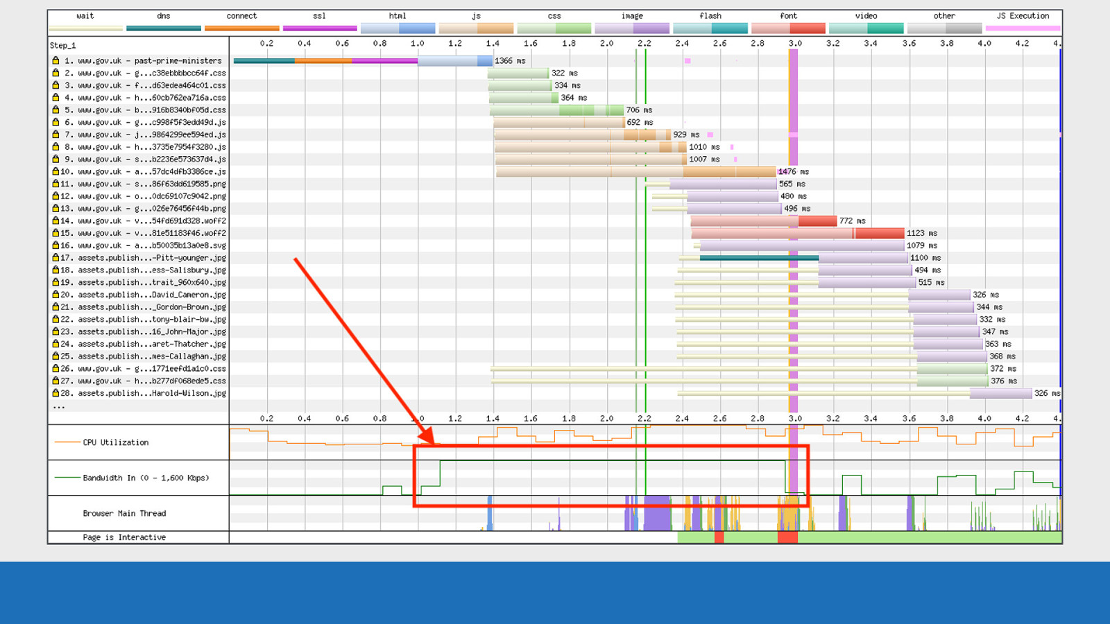
GDS Also notice how busy the CPU / bandwidth / main thread graphs are. This page is really working this device in all areas. That’s not always necessarily a bad thing. That’s a lot of “useful work” happening.
Slide 39

Vertical Lines You may have noticed a set of lines in different colours vertically down the page.
Slide 40
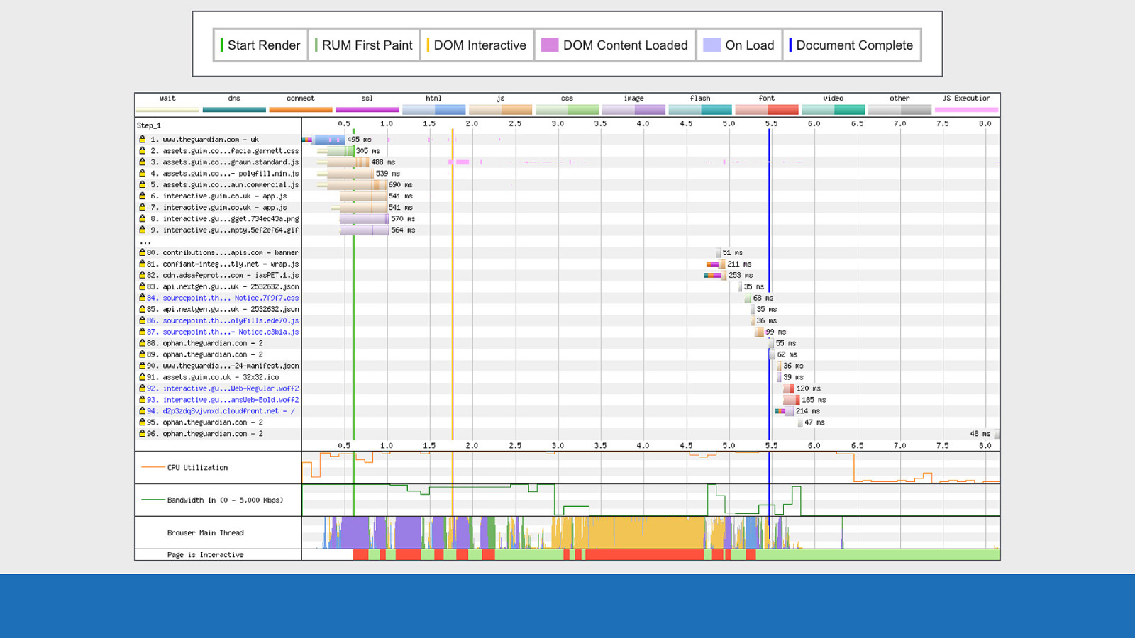
GDS These lines are specific events that happen during page load.
Slide 41
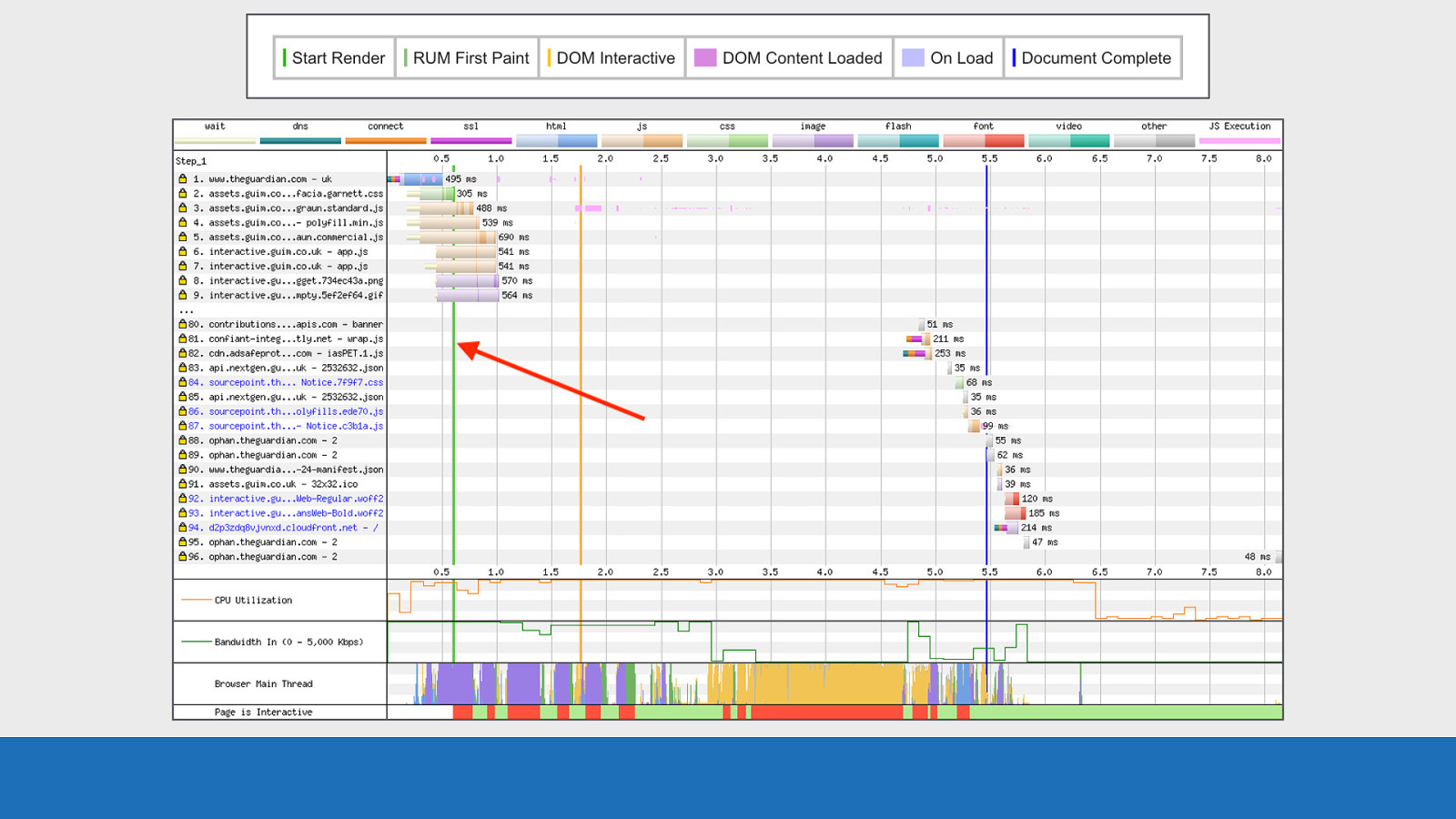
GDS In the example on the slide we see start render in green at 0.6 seconds. Here the first pixels are painted to the screen.
Slide 42
GDS DOM Interactive at 1.75 seconds in orange. HTML has been parsed and the DOM constructed.
Slide 43
GDS Document Complete (onload fired) at 5.5 seconds. Static image content loaded but changes triggered by JS execution may not be included. There are other lines that aren’t on this chart but can be seen in the key above the waterfall on screen. So look out for these too.
Slide 44

Request Details And finally the request details panel.
Slide 45
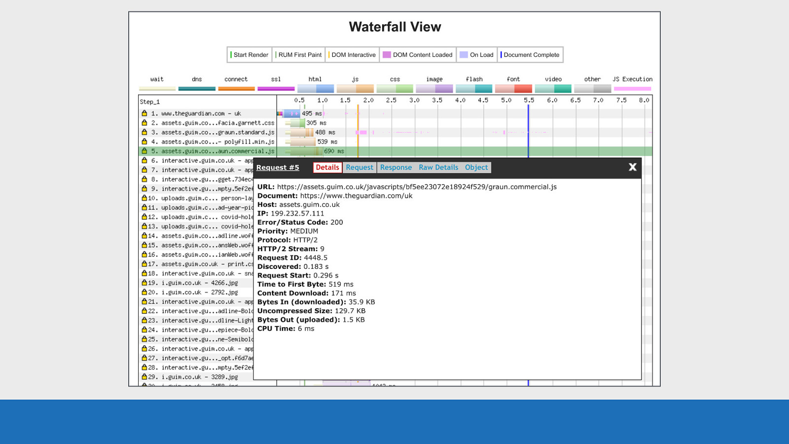
GDS Each horizontal row is an asset request. If you click anywhere on a row, a panel will pop-up with a heap of information specifically about the selected request and the response back. Basic details like the protocol and timings, all the way through to request / response headers.
Slide 46
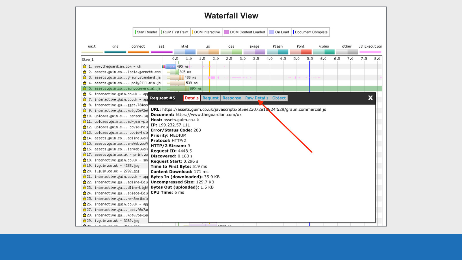
GDS If you are looking for all these details in a large JSON blob, then the ‘Raw Details’ panel will give you this. Using this panel for each request you really can dig down into the details.
Slide 47

Beyond the basics So now we’ve gone into the basic layout and what it all means, let’s look at some more advanced examples and point out some other features.
Slide 48
HTTP/1.1 vs HTTP/2 Using WebPageTest it’s easy to examine the difference between HTTP/1.1 and HTTP/2. It’s a good example to focus on as it’s really easy to spot the differences. Both tests are from testing GOV.UK on Desktop Chrome using a 3G connection.
Slide 49

GDS First let’s look at HTTP/1.1:
Slide 50
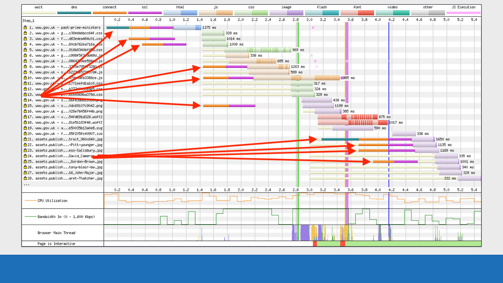
GDS Notice the multiple TCP connections
Slide 51
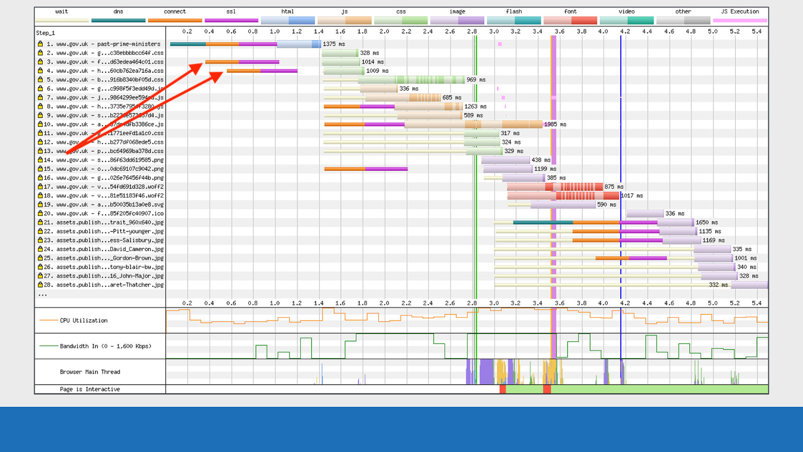
GDS Notice how eager the connections are on request 3 & 4. This is default browser behavior for HTTP/1.1 where it creates multiple connections early in anticipation for downloading multiple assets.
Slide 52
GDS There’s 2 DNS lookups (shown in red), which are then reused for the other TCP connections (shown in green).
Slide 53
GDS And what are known as “download chunks” can be seen heavily in requests 5-7 and 17-18.
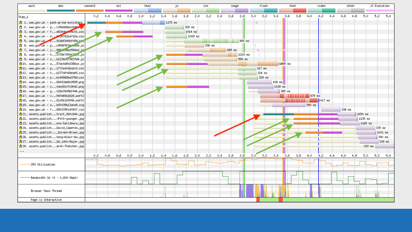
Slide 54

GDS So what are download chunks? This is where the two colour shades I mentioned at the start come in. The lighter colour at the start is the time at which the browser sent the request to the server.
Slide 55
GDS The dark chunks are data coming back from the server for this particular request.
Slide 56
GDS You may be asking what the yellow wait time bars signify? So this is the point at which the HTML has been parsed, but the request for the asset has yet to be made. You can see this in the waterfall by looking at where the blue HTML ends, and the yellow wait bars start. In the case shown here this wait is because there are no free established TCP connections to make the request.
Slide 57
GDS Also notice how the bandwidth chart has empty “sections” missing from it. In this example we have separate TCP connections fighting for limited bandwidth. But even with multiple TCP connections the bandwidth isn’t fully utilised. This is what I meant before by the term “useful work”. By making sure the network connection is fully utilised during this important loading phase, it should in theory improve performance by maximising the number of bytes received by the browser.
Slide 58

GDS Now let’s compare the exact same page, browser and connection under HTTP/2. First thing to mention is how overall this waterfall looks a lot cleaner.
Slide 59
GDS There’s now only a single TCP connection on request number 1 used for all the asset downloads. There’s not as much download chunking, as prioritisation is happening over a single connection. Under the hood Chrome sets the ‘exclusive’ flag for the stream dependencies on each resource, so it downloads the assets in order from a long internal list.
Slide 60
GDS
Here’s an interesting observation. We seemingly have a single rogue DNS lookup on request 17, but it has no associated connection and SSL negotiation (orange and pink coloured bars). This is actually HTTP/2 connection coalescing in action. The assets domain and the root domain are different domains but they are on the same infrastructure. They both share the same IP address and SSL certificate, so the browser can use the existing TCP connection and SSL negotiation that was established on request 1. Therefore all assets will download over the same single connection, even though they are on separate domains.
Slide 61
GDS Note the bandwidth from 1.1 to 3 seconds is maxed out. We don’t have gaps over this time period like with did with HTTP/1.1. This is “useful work” being done by the connection.
Slide 62
GDS If I quickly flick back and forth between the 2 we really get to see the difference between the waterfalls. Here we see that WebPageTest has exposed the internals of how the browser downloads a page under specific conditions. If I were to run the same test through Firefox, or IE this picture would look very different.
Slide 63

GDS If I quickly flick back and forth between the 2 we really get to see the difference between the waterfalls. Here we see that WebPageTest has exposed the internals of how the browser downloads a page under specific conditions. If I were to run the same test through Firefox, or IE this picture would look very different.
Slide 64
Chunk Data Briefly going back to the subject of download chunks again, there’s a very simple way to see the data that powers the chunk visualisation.
Slide 65
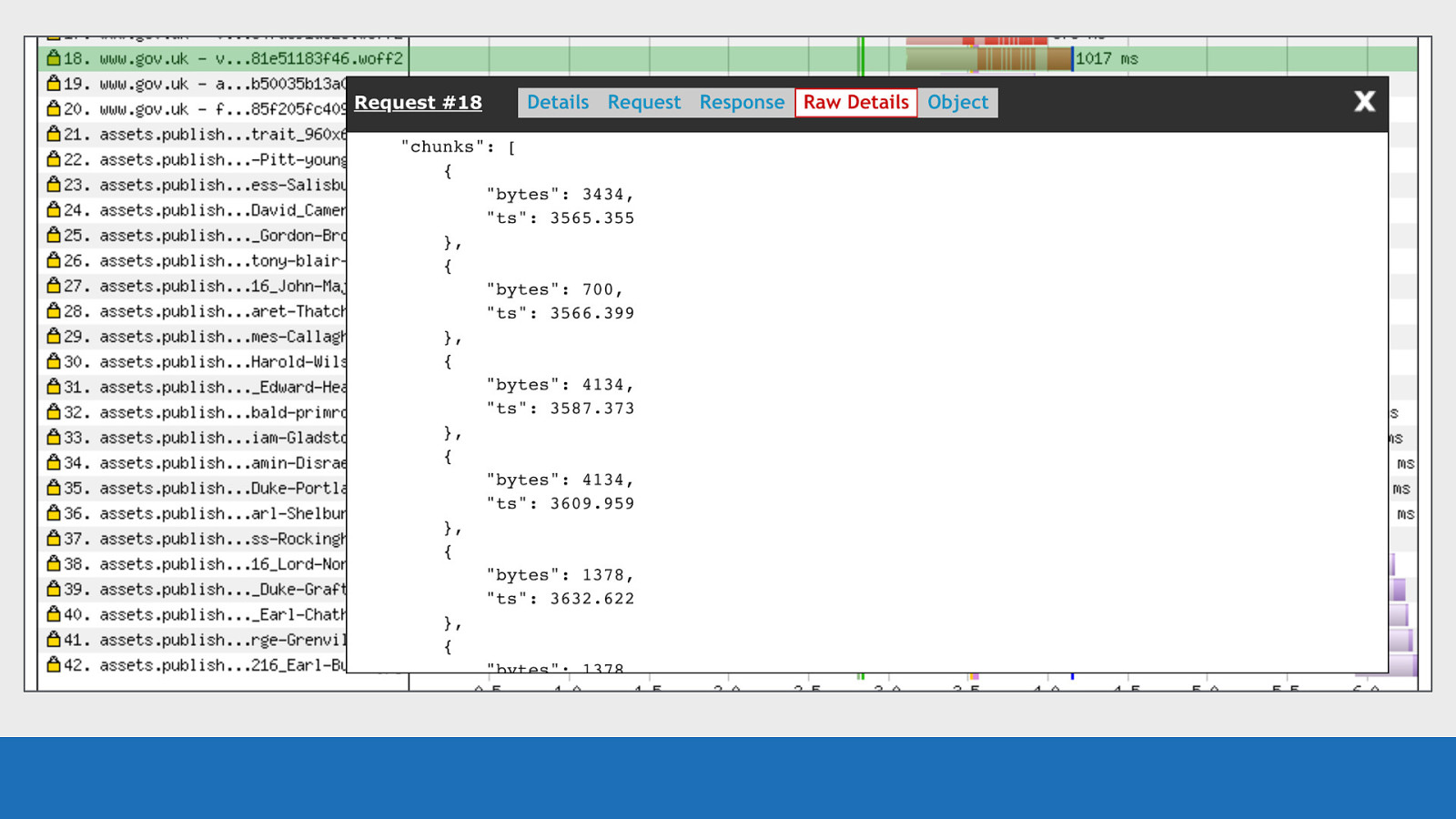
GDS Clicking on the request you want to examine, you’ll see a ‘Raw Details’ tab (this tab was mentioned before). This tab gives you all the JSON related to this particular request (row). Scrolling down this tab you’ll see a ‘chunks’ array. This array contains multiple objects. Each object contains the timestamp of when the chunk completed (not started), and the number of bytes downloaded in this chunk. WebPageTest works backwards from the completed time. It then looks at the number of bytes downloaded and the available bandwidth at the time to calculate the chunk width to be displayed in the visualisation.
Slide 66
Error/Status Codes Next up are the error & status codes.
Slide 67
GDS
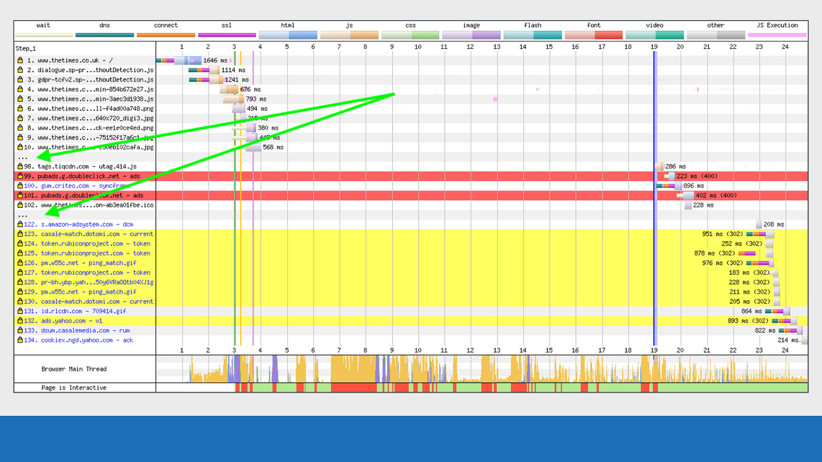
WebPageTest will make it very obvious when it encounters a status code other than 200. Just a brief note on the chart used in this example: It’s very easy with a JavaScript and asset heavy page for a chart to be 100’s of requests long. In the example, many requests have been omitted from the waterfall chart to make it more readable. These omitted requests can be identified by the three dots highlighted green.
Slide 68
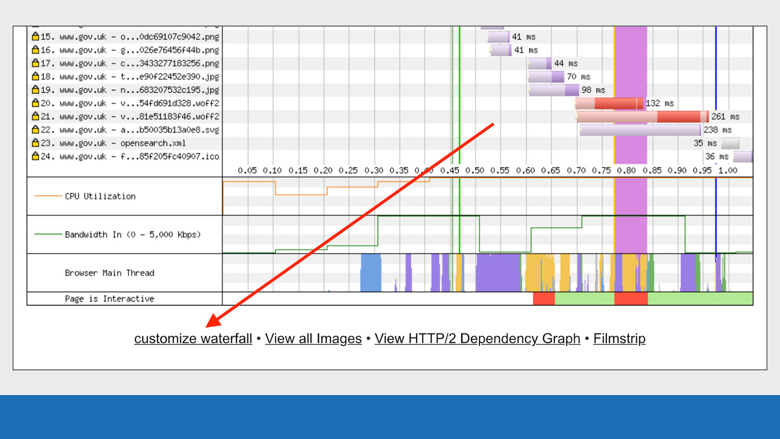
GDS Look for the “customize waterfall” link under the waterfall diagram to do this.
Slide 69
GDS
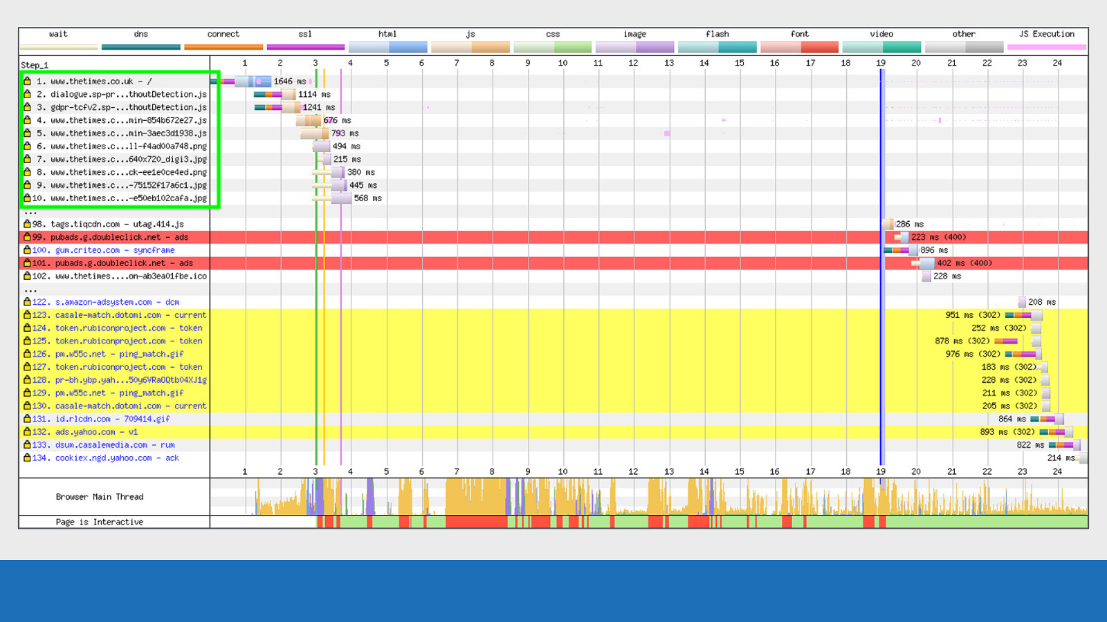
Back to our error / status codes: Requests 1-10 are fine, all 200 status codes.
Slide 70
GDS Requests 99 and 101 are error codes. The red background may have given this away!
Slide 71
GDS
In this case they are from 400 response codes, which refers to a bad request. The status code is seen in brackets after the request timing data.
Slide 72
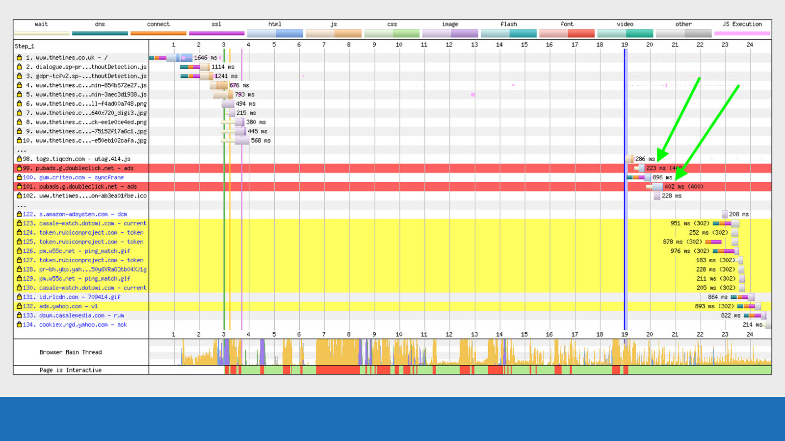
GDS The timing value seen is the time taken to complete the request. This includes a TCP connection negotiation if required, but excludes wait time.
Slide 73
GDS
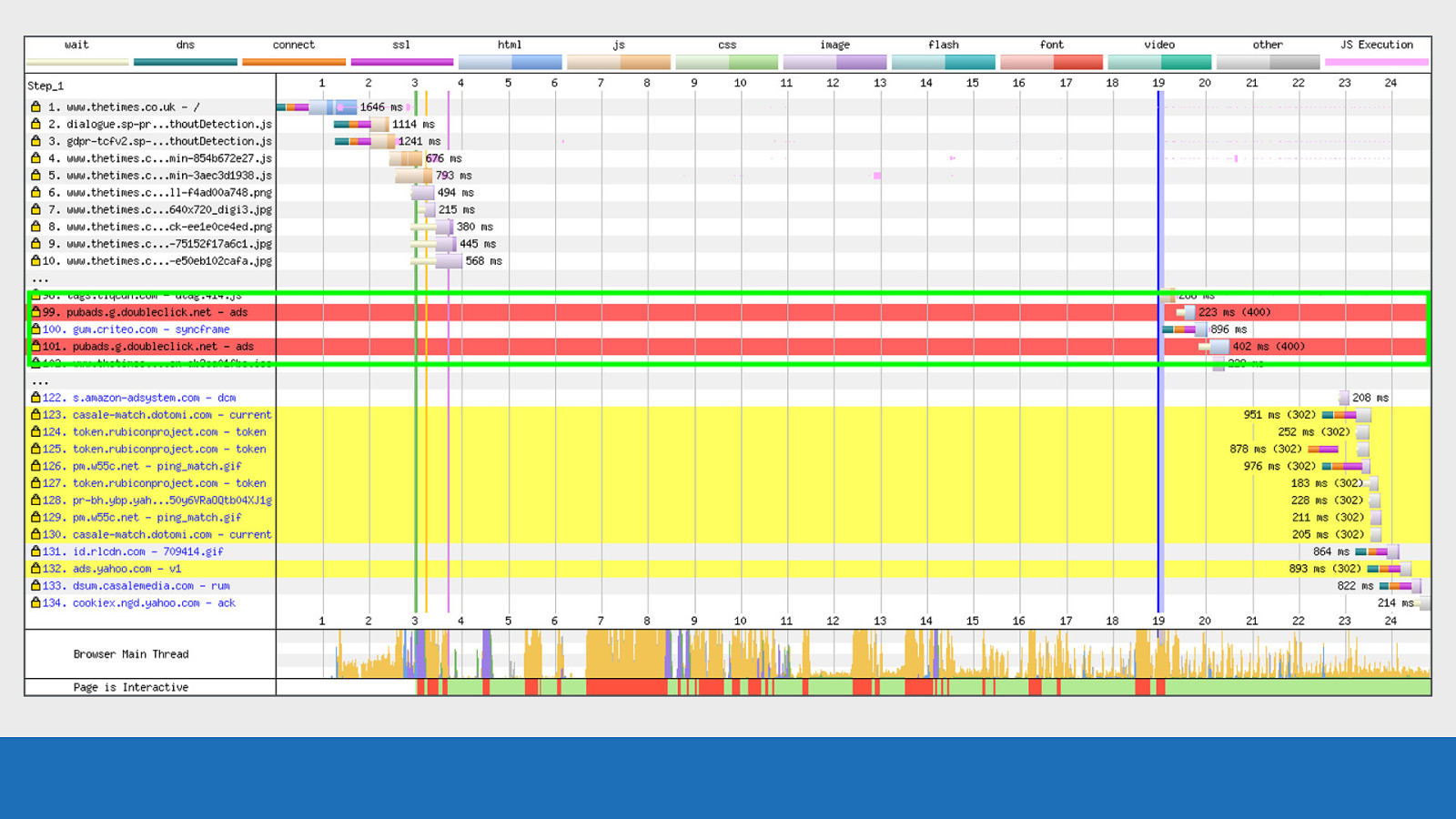
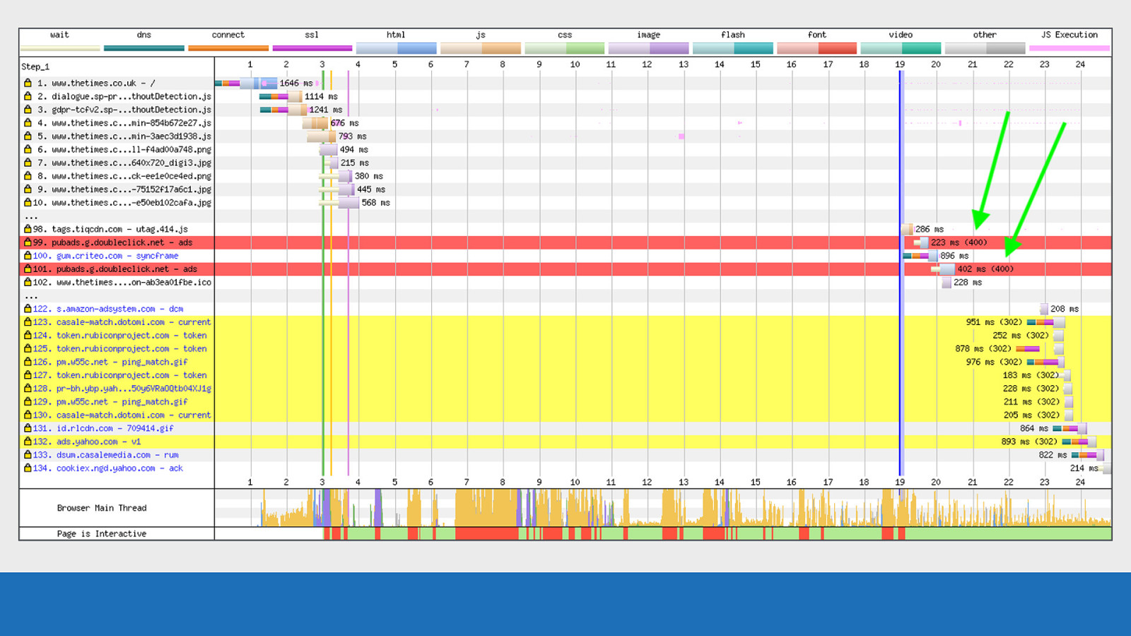
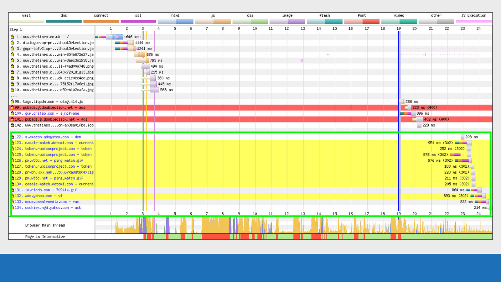
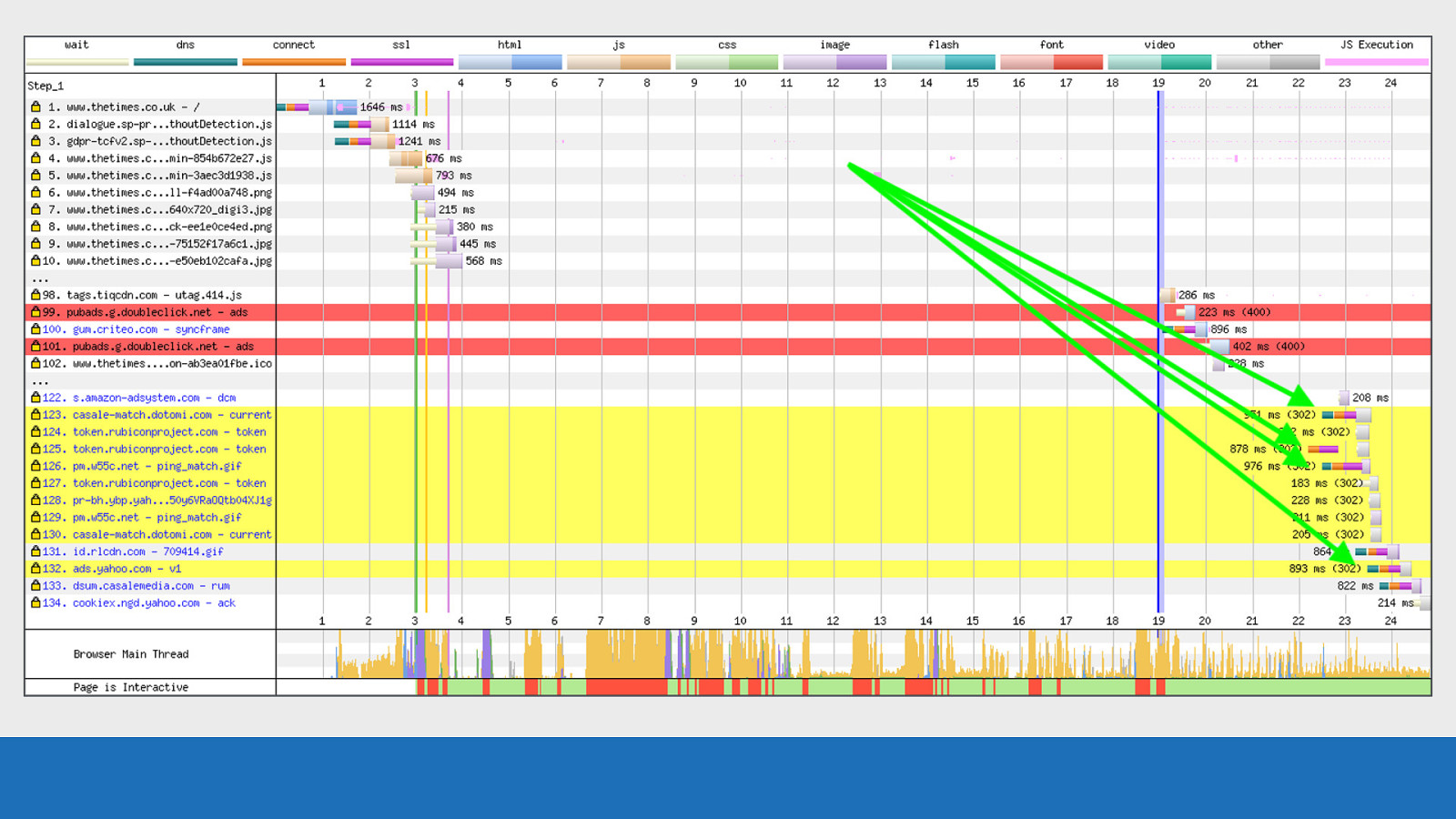
Requests 123 to 130 are 302 status codes and are seen with a yellow background. The 302 code is the ‘Found but temporarily moved’ status code.
Slide 74
GDS
Notice how the browser still has to setup expensive TCP connections in a few instances just to receive this 302 status code. This is certainly something to watch out for when using third parties.
Slide 75
Identifying the request initialiser Next up a recent addition, prompted I believe by Andy Davies.
Slide 76
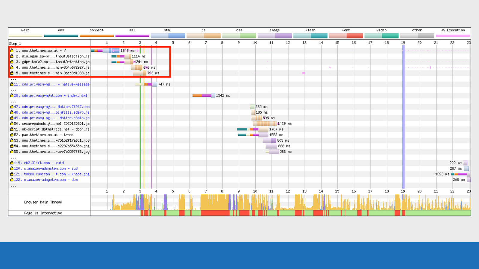
GDS Each request comes with a “Document” value in the details panel that tells you where the request was initialised from. Requests 2-5 are initialised from the root document. This can be seen as the text is black.
Slide 77
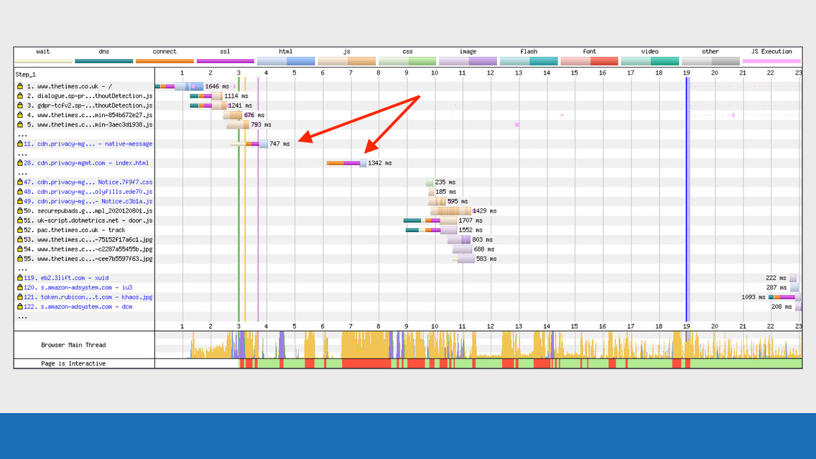
GDS Request 11 and 28 are for new HTML documents. The text is blue to signify they have a new document value, so the request was initialised from a somewhere other than the root document. This is most likely iframes in this instance.
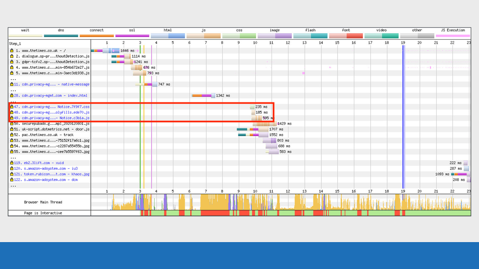
Slide 78
GDS Notice further down requests 47-49 are also blue. These are assets being downloaded by the iframe. The blue request text doesn’t only happen with iframes, it also happens with Service Workers and all the assets they load.
Slide 79
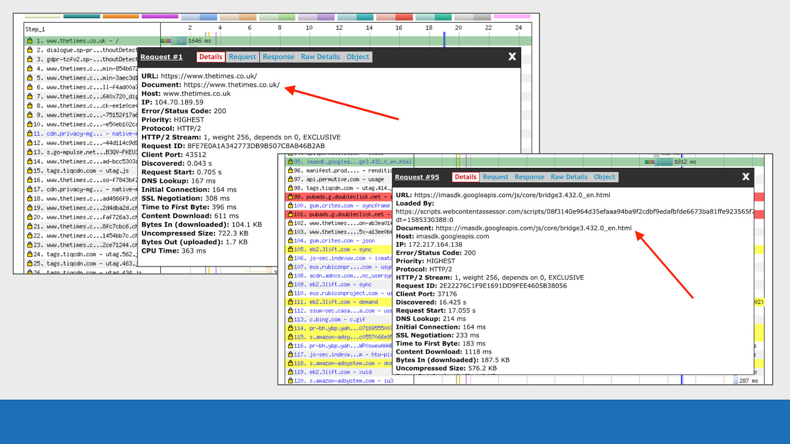
GDS And here’s how it is displayed in the details panel when clicking on the requests ● Top image we see the root document ● Bottom image is a third-party iframe from google with a different document value
Slide 80

JavaScript Execution I mentioned the pink lines for JavaScript execution earlier.
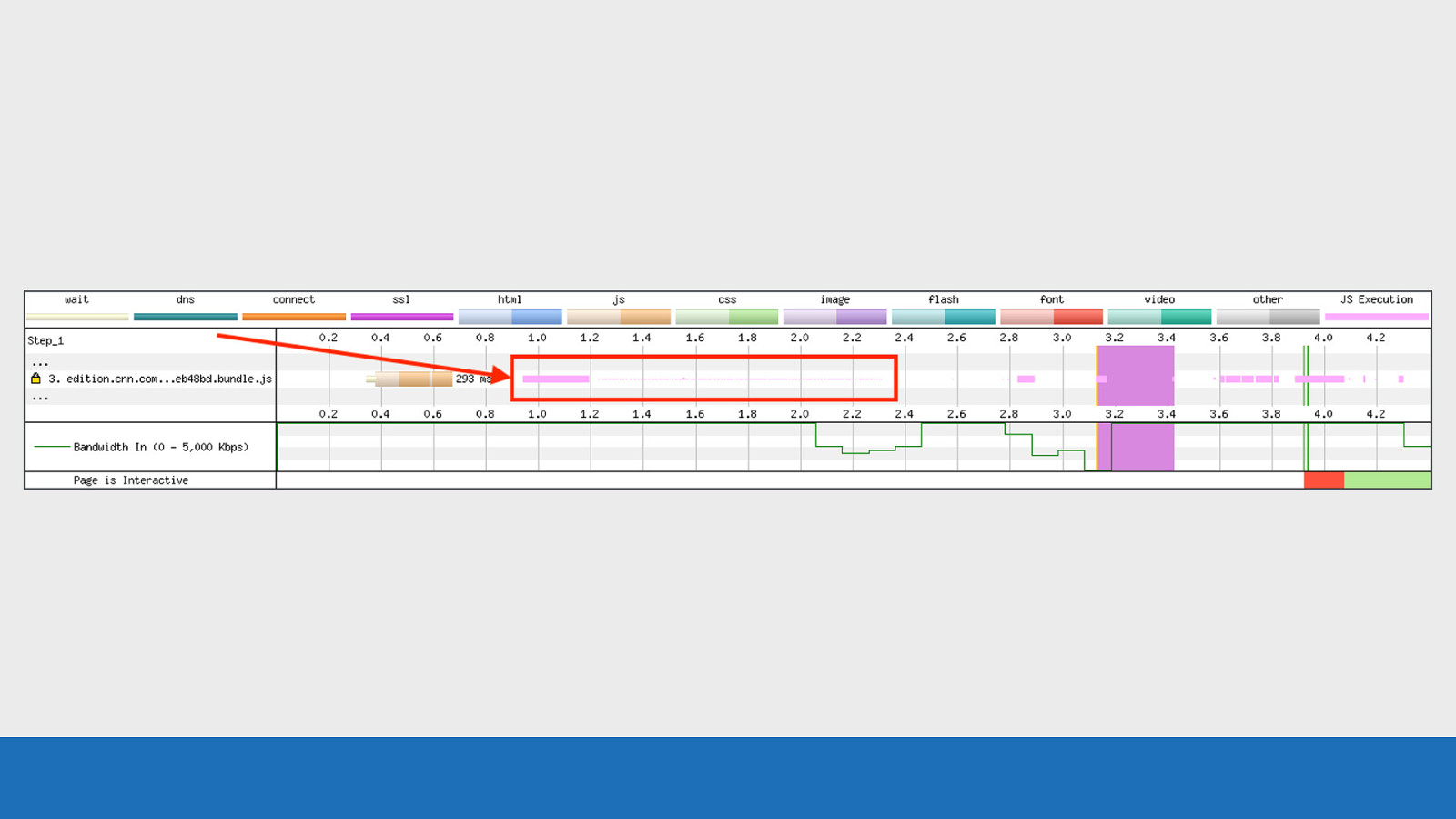
Slide 81
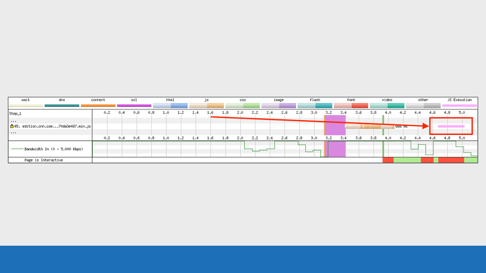
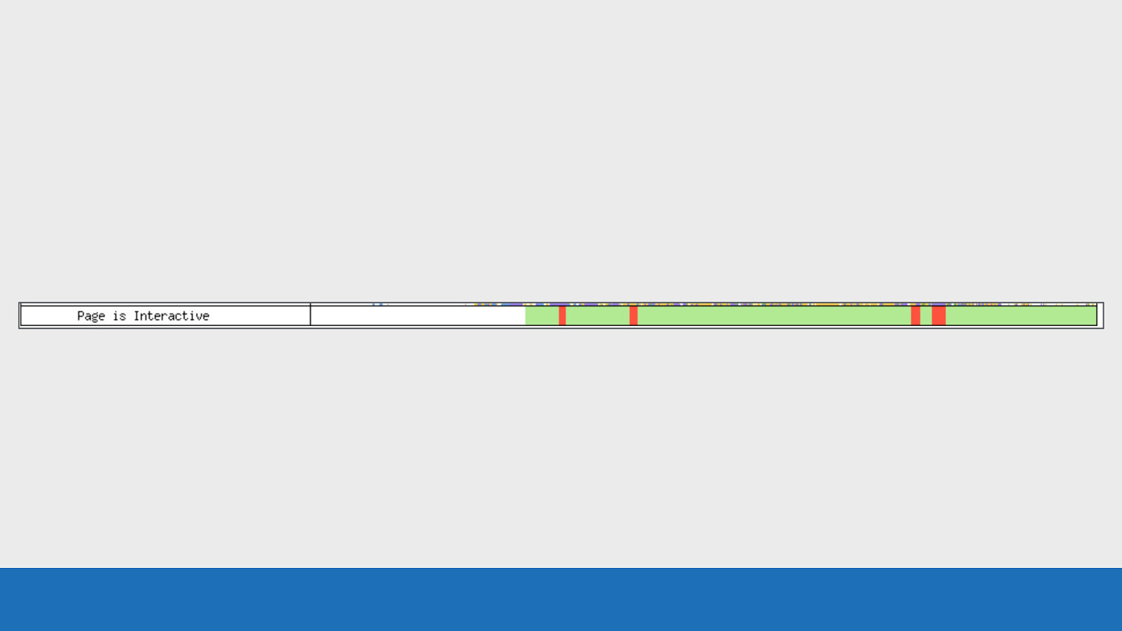
GDS The JavaScript execution can be seen in pink on the request row which triggered it. In this example we see a solid block of pink. But is this very intensive JavaScript running or just short but fast repeating execution? Looking at the “Page is Interactive” bar below it gives an indication in this example, since it is solid red. But a recent modification to the JavaScript visualisation has made this feature even more useful.
Slide 82
GDS Now when JS execution is rendered you don’t always just see a solid block of pink. The height of the pink bars indicates how quickly the JavaScript ran. So fast but frequent JS execution will have very short height bars, so they no longer dominate the view. Note that this functionality is only available in Safari and Chromium based browsers. Firefox doesn’t expose this information.
Slide 83
User Timing Marks Wouldn’t it be great if we could add our own custom markers to the waterfall chart to see where certain events happened during page load.
Slide 84
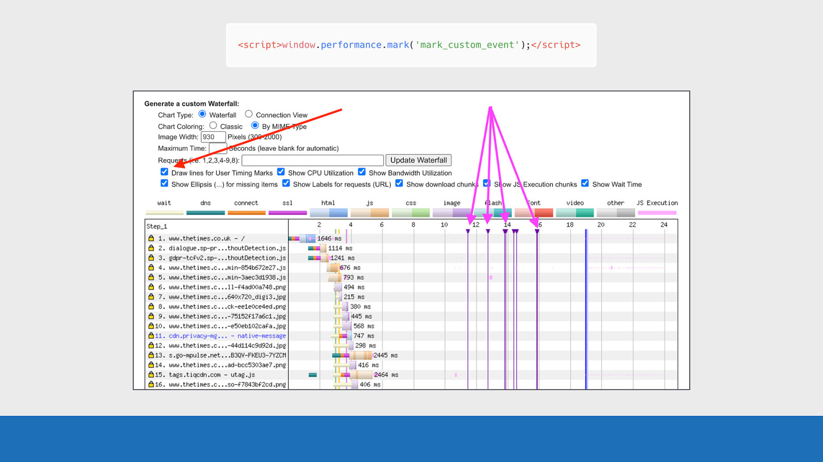
GDS It’s actually fairly simple. Just use the mark method in the User Timing API and add it to your page code. These marks will be shown on the waterfall as vertical purple lines. Note, these user timing marks don’t show up in the default waterfall chart on the public instance of WebPageTest, but if you have your own instance it can be enabled by default. The only way to see them using the public instance is to view the waterfall using the “customise waterfall” link below the waterfall chart, which I mentioned earlier. That’s the view we can see in the slide. The reason for this is because: many third-parties leave these marks in their code, meaning there would be a lot of noisy looking waterfall charts when using third-parties.
Slide 85
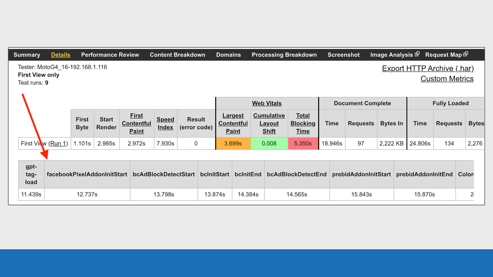
GDS And last point on this, the actual timings of each of these custom events is shown just below the summary table for the test run.
Slide 86

Scenarios So let’s quickly look at some scenarios and see what we can learn.
Slide 87

Chrome Stair-Step Now you may have seen this pattern in the previous slides I’ve shown, but I just haven’t pointed it out to you. When running a test using Chrome, the resulting waterfall will have a common pattern.
Slide 88
GDS This pattern is called the stair step. Top step can be seen in the red, bottom step in the black. So what’s happening here? This is essentially a separation between assets in the head and the body. It’s a prioritisation strategy Chrome uses to improve performance. Chrome will dedicate most CPU and bandwidth to getting the page head setup, before then concentrating on assets in the body.
Slide 89
GDS This example is under HTTP/1.1. Notice the TCP connection at request 15. This request is for an image that is located in the body, but it’s being requested at the same time as the head assets. So Chrome isn’t completely ignoring the body, but resources in the head are the priority
Slide 90

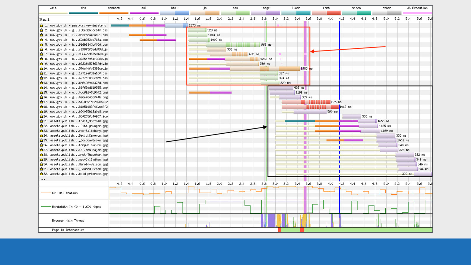
CPU Bottleneck So I mentioned earlier about the CPU graph at the bottom of the waterfall chart. So here’s an example of what can happen to a waterfall chart when the device is CPU limited.
Slide 91
GDS It looks fairly standard until we look closely, then we will notice the gaps between requests. These gaps on requests 24 to 26 show a large amount of inactivity that has a huge impact on performance.
Slide 92
GDS If we examine the CPU graph directly below these gaps it points to the reason why they are happening. The graph is maxed out at 100% over this time period.
Slide 93
GDS But we see the opposite for the network activity. There’s nothing really happening.
Slide 94
GDS Examining the browser main thread, there’s some script parsing & execution (in orange), some page layout tasks (in purple). But nowhere near enough activity to cause the CPU issue seen here, so something odd is going on. I’m afraid I don’t have an explanation as to why the CPU is so maxed out. Maybe a low spec device that was having issues. But it shows how useful the other graphs can be when used in conjunction with the waterfall chart.
Slide 95
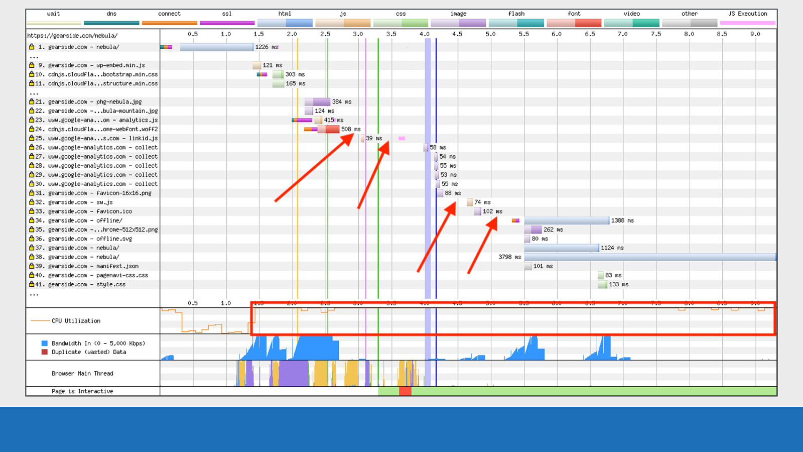
Preloading fonts Preloading fonts is always an interesting topic to discuss. If done correctly it can improve perceived performance. But you need to be careful, as it’s also quite easy to make performance worse.
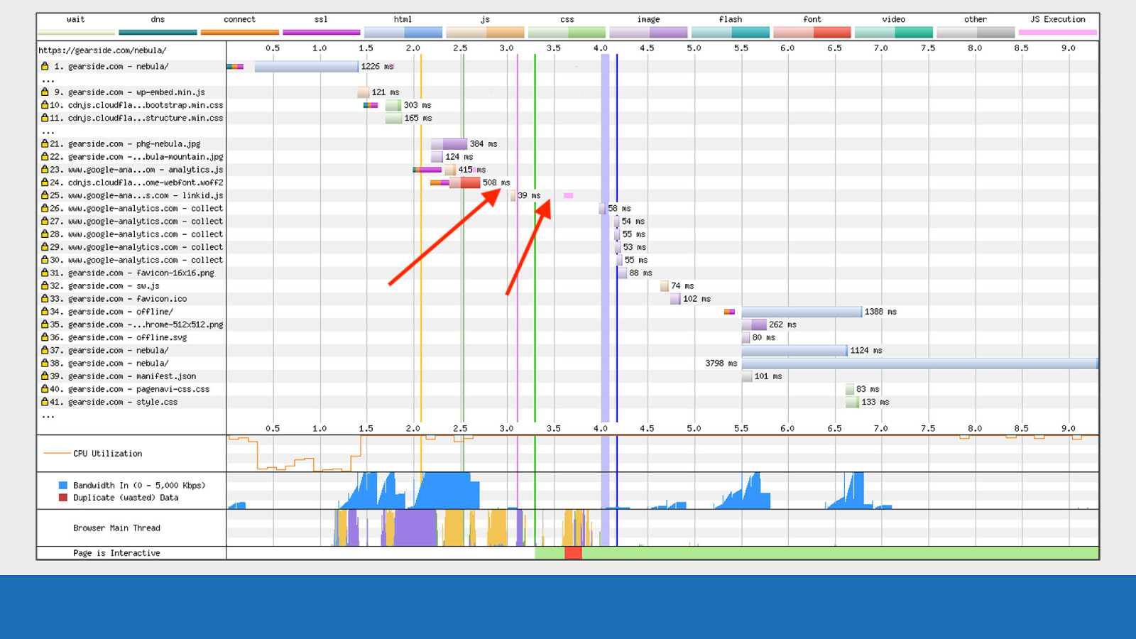
Slide 96

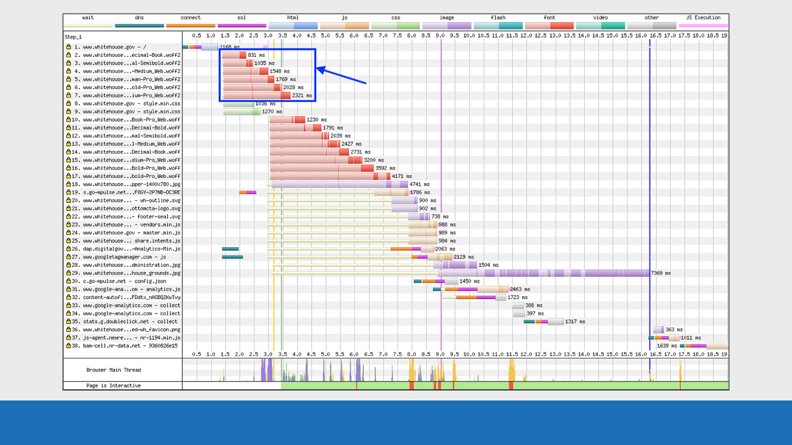
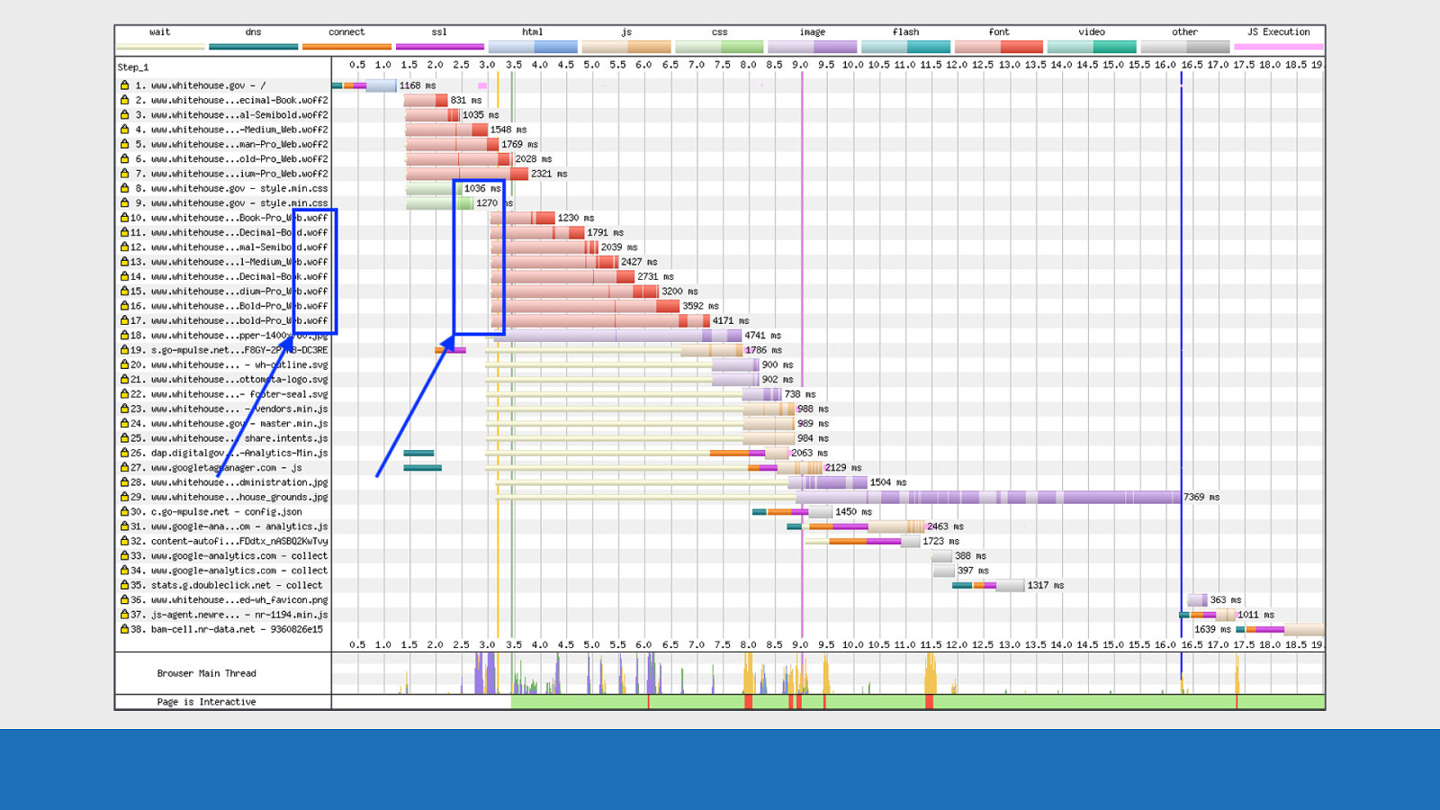
GDS So this is a very recent example of where WebPageTest came in useful, as it was very obvious the browser was loading too many fonts (seen in red). Here we see the waterfall graph for the new White House website.
Slide 97
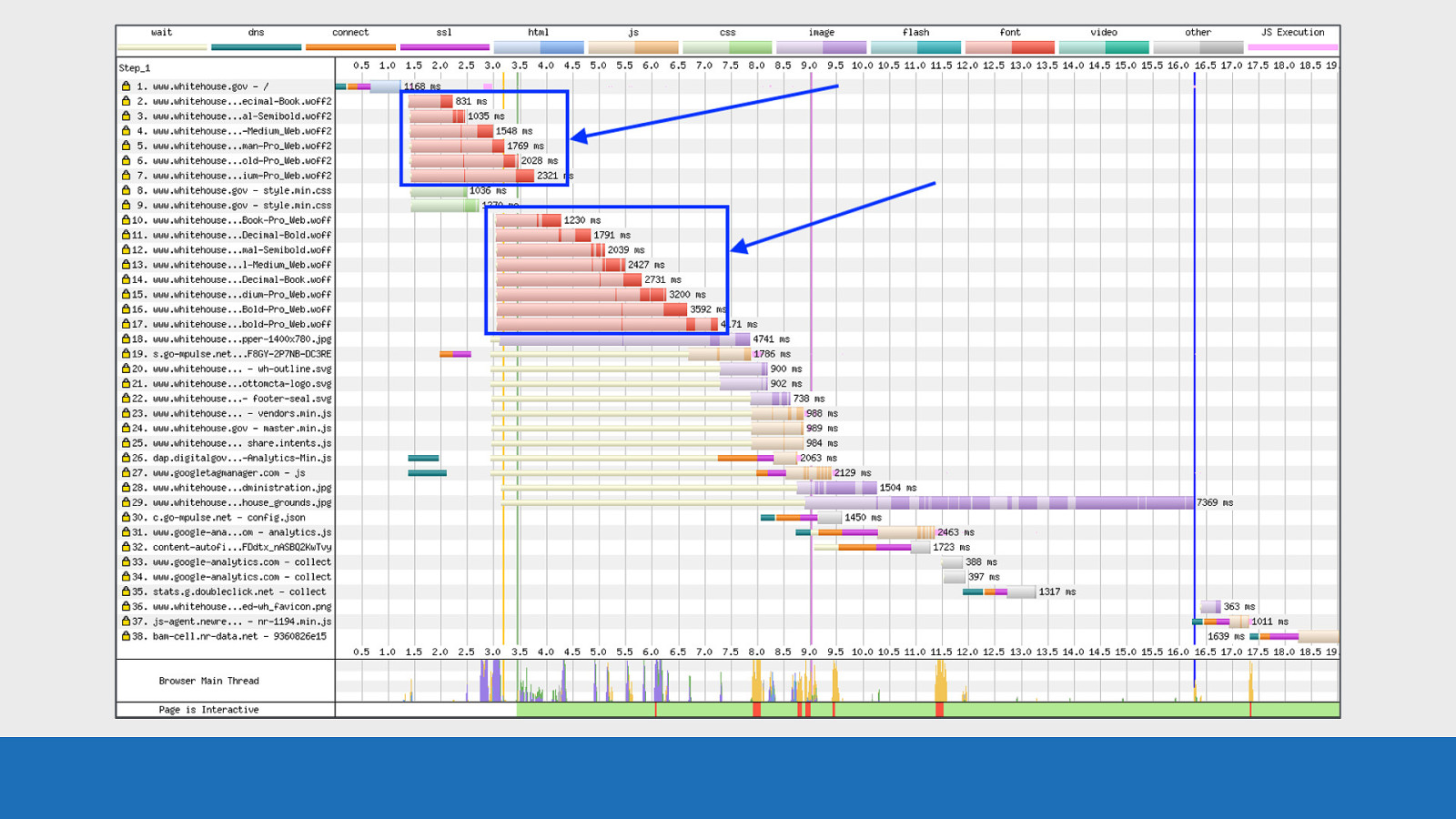
GDS Highlighted in blue are all the fonts being downloaded by the browser.
Slide 98
GDS Notice the location of the top set of fonts in the waterfall. They are requested right after the HTML has parsed on request 1, but before the CSS has been requested and parsed on requests 8 & 9.
Slide 99
GDS
This is a sure sign that these fonts are being preloaded If we now turn our attention to the second set of fonts.
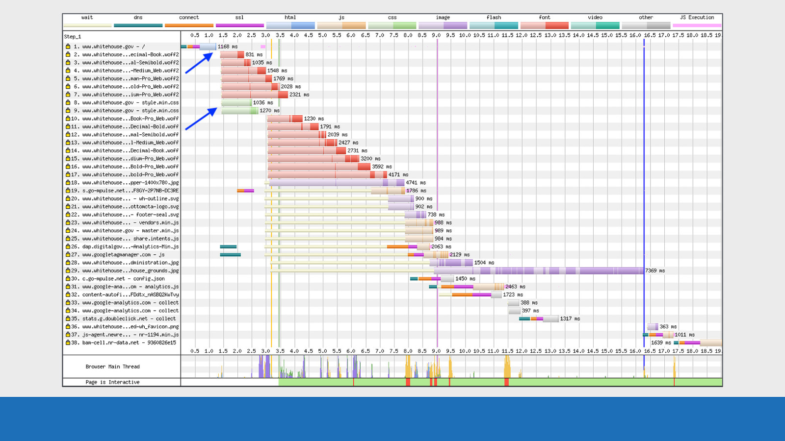
Slide 100
GDS Notice how these fonts are initialised after the CSS has been parsed. Also take a look at the extension of these fonts. They are WOFF.
Slide 101
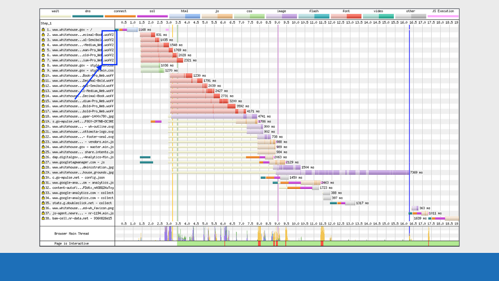
GDS Looking back at the preloaded fonts, these are WOFF2. So we have a font mismatch here. WOFF2 fonts are being preloaded, but WOFF fonts are being used in the CSS.
Slide 102
GDS
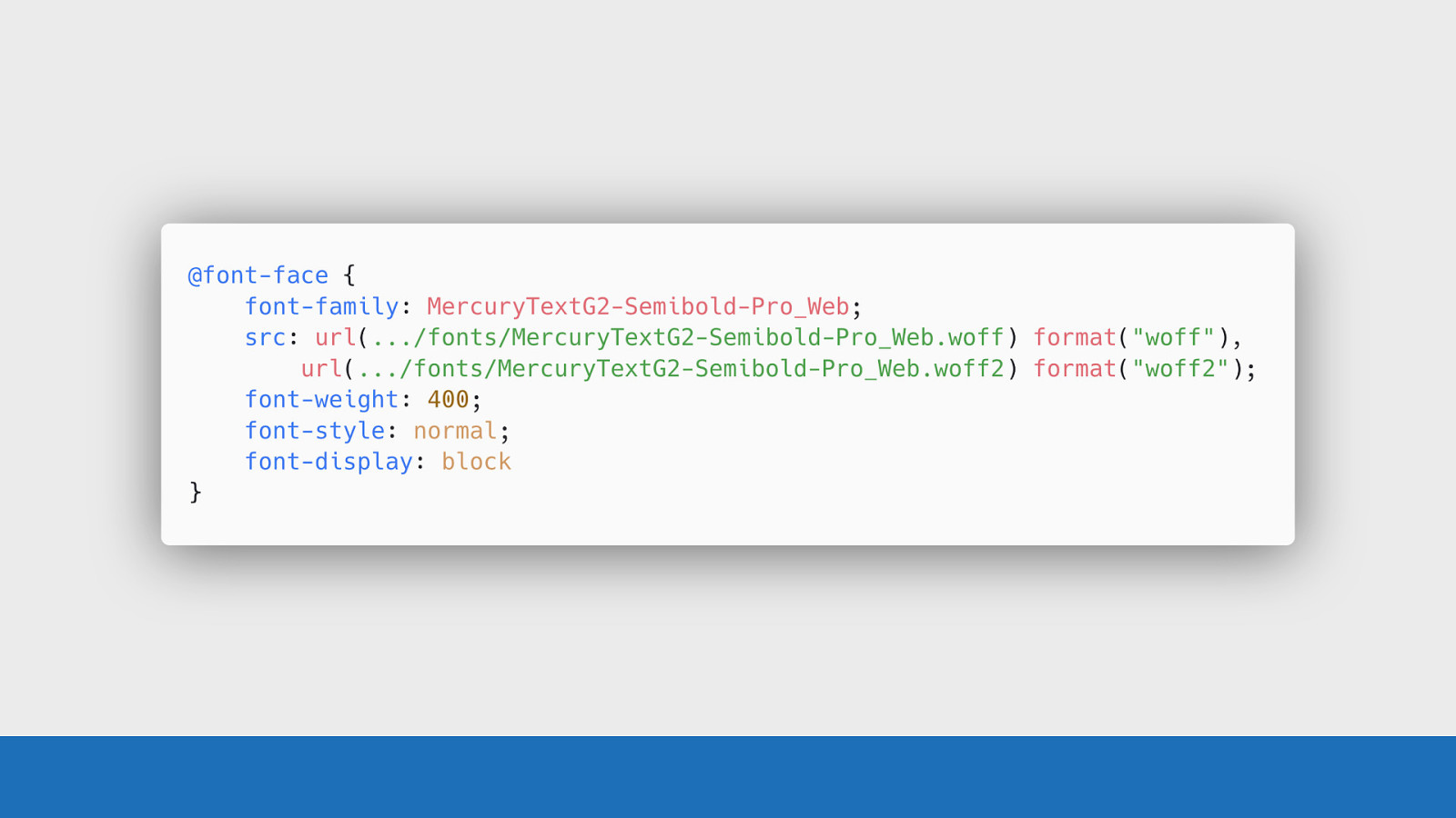
Examining the CSS we can actually see the issue in the @font-face rule. The WOFF font source is placed before the WOFF2 font source.
Slide 103
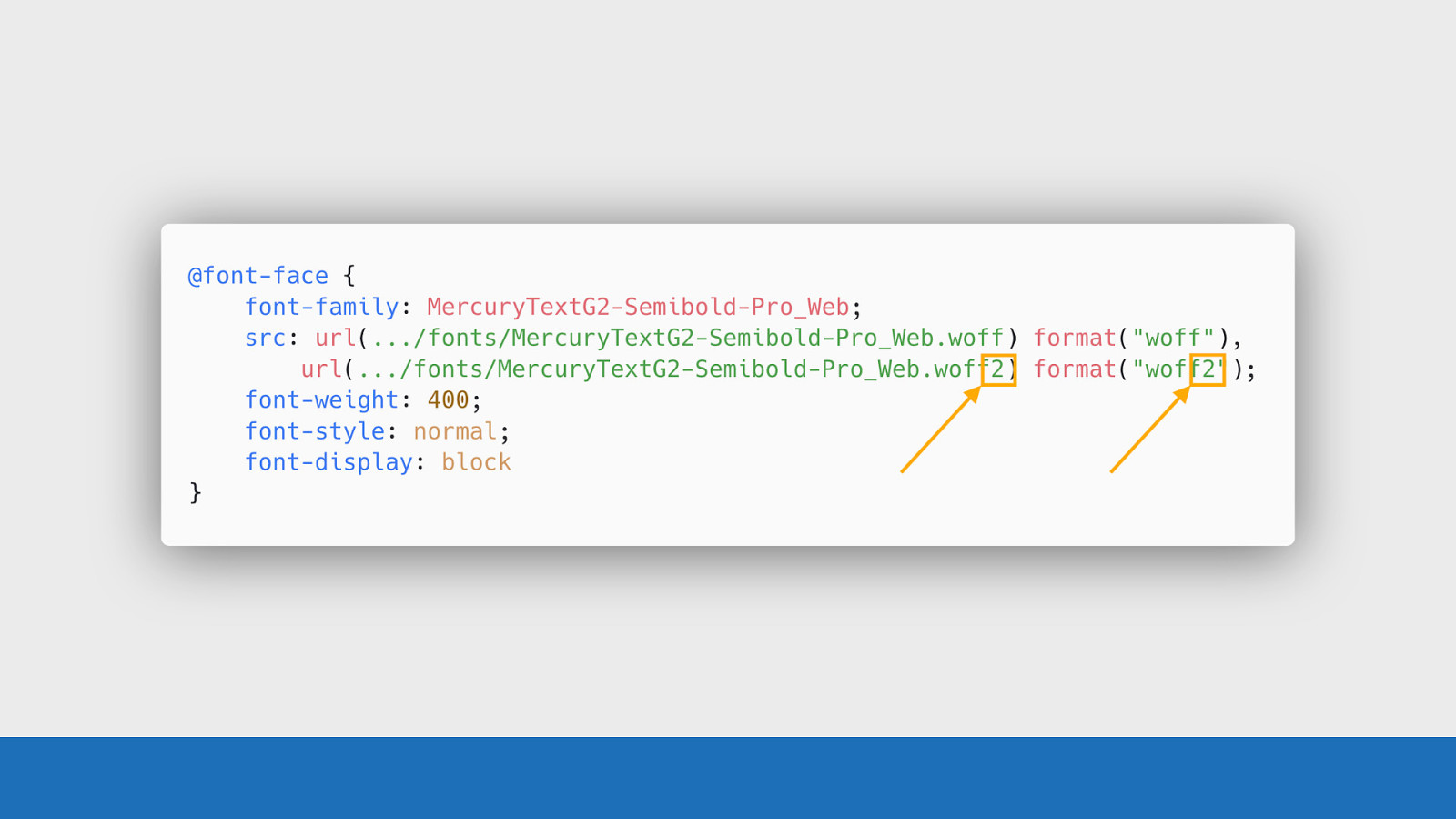
GDS Or to put it another way, the mistake with these 2 characters have meant the browser is having to download an extra 7 font files, or approximately 500 KB of extra font files.
Slide 104
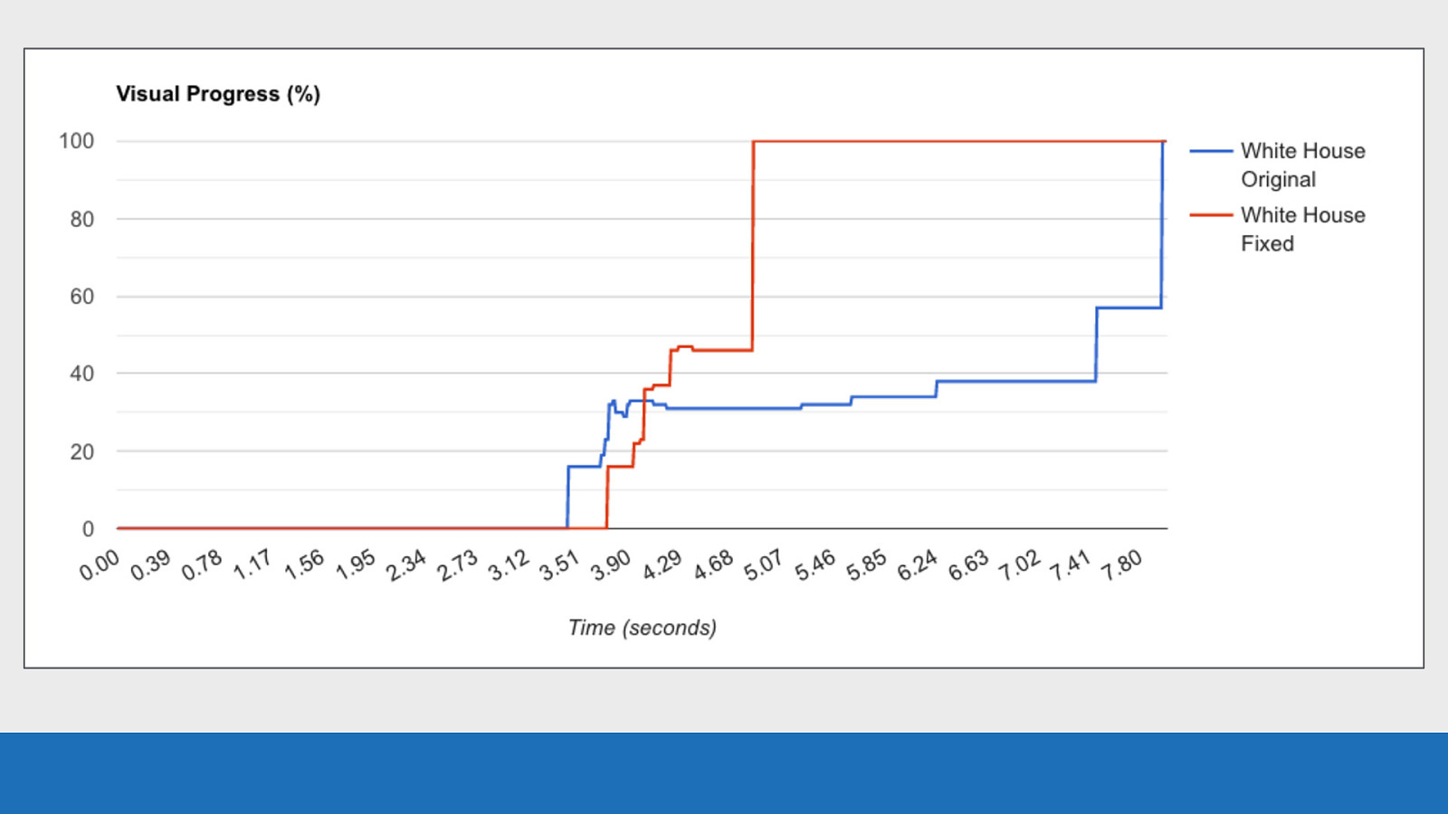
GDS This is such a simple mistake to make as a developer, that without WebPageTest you’d be very hard-pressed to spot the issue. The image on screen shows the visual progress of the White House website before and after the fix went live, showing much improved performance. And it’s all thanks to WebPageTest’s waterfall chart. I have a post all about this specific waterfall on my blog if you are interested.
Slide 105

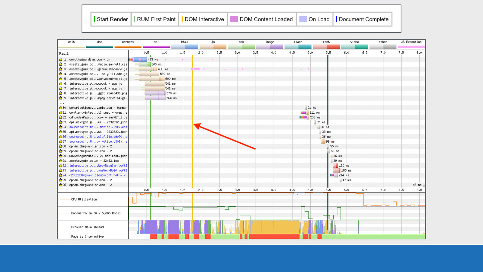
Vary unusual waterfall And finally an unusual waterfall that cropped up in a government service recently. And another shameless plug, I have a blog post about this waterfall chart too.
Slide 106
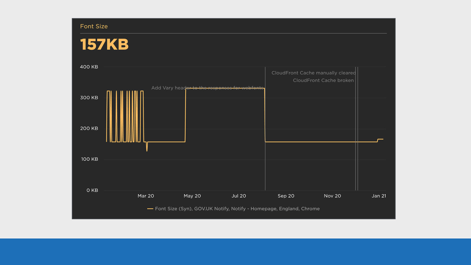
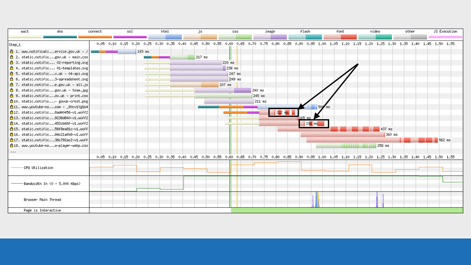
GDS We use SpeedCurve to monitor our services at GDS. These tests run every day to look for web performance issues. On this service we saw the number of fonts being downloaded literally double overnight from 3 to 6. Nothing had changed, no releases, no code deployed. It just happened randomly. Examining the graph we can see the font size double. In fact the historic graph data shows this issue has randomly happened and fixed itself many times in the past.
Slide 107
GDS
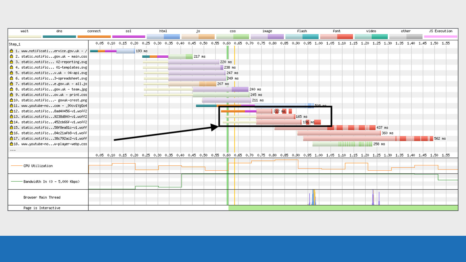
If we look at this waterfall it gives some insight into what’s happening. Looking at requests 12-14 for the WOFF2 fonts, we see this really strange set of gaps between the download chunks. (ZOOM into it) [CMD+alt+8] Now it took a while to figure what the issue was but “long story short”: we weren’t serving the vary: origin header with our fonts. The CDN cache was being ‘poisoned’ and serving up the fonts with the incorrect headers. A device was connecting, the headers for this first device were being cached by the CDN and then served to our test browser on another device. The browser was seeing these incorrect headers from the first device and immediately rejecting the fonts.
Slide 108
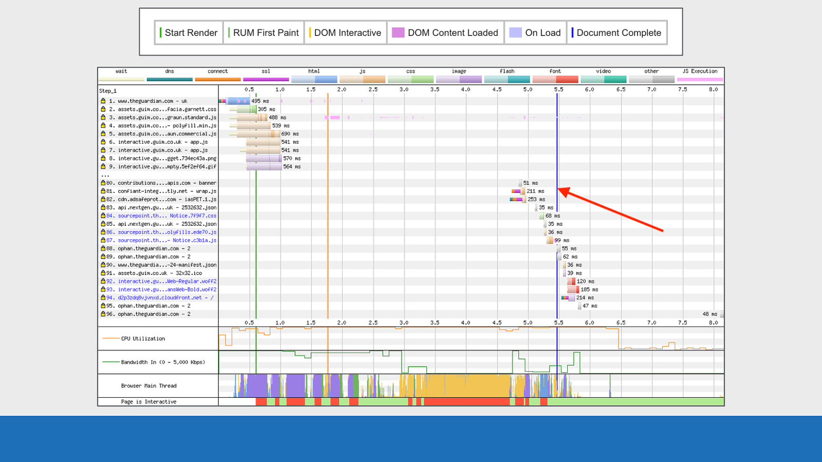
GDS We can actually see this all happening in the waterfall: Request 12-14 are made for the WOFF2 fonts.
Slide 109
GDS Very thin slices of data received back from the server (probably the headers). (Zoom in) [CMD+alt+8]
Slide 110
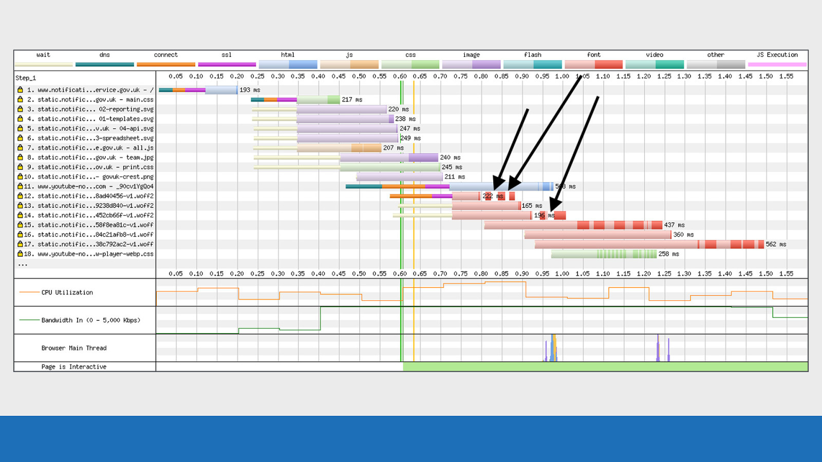
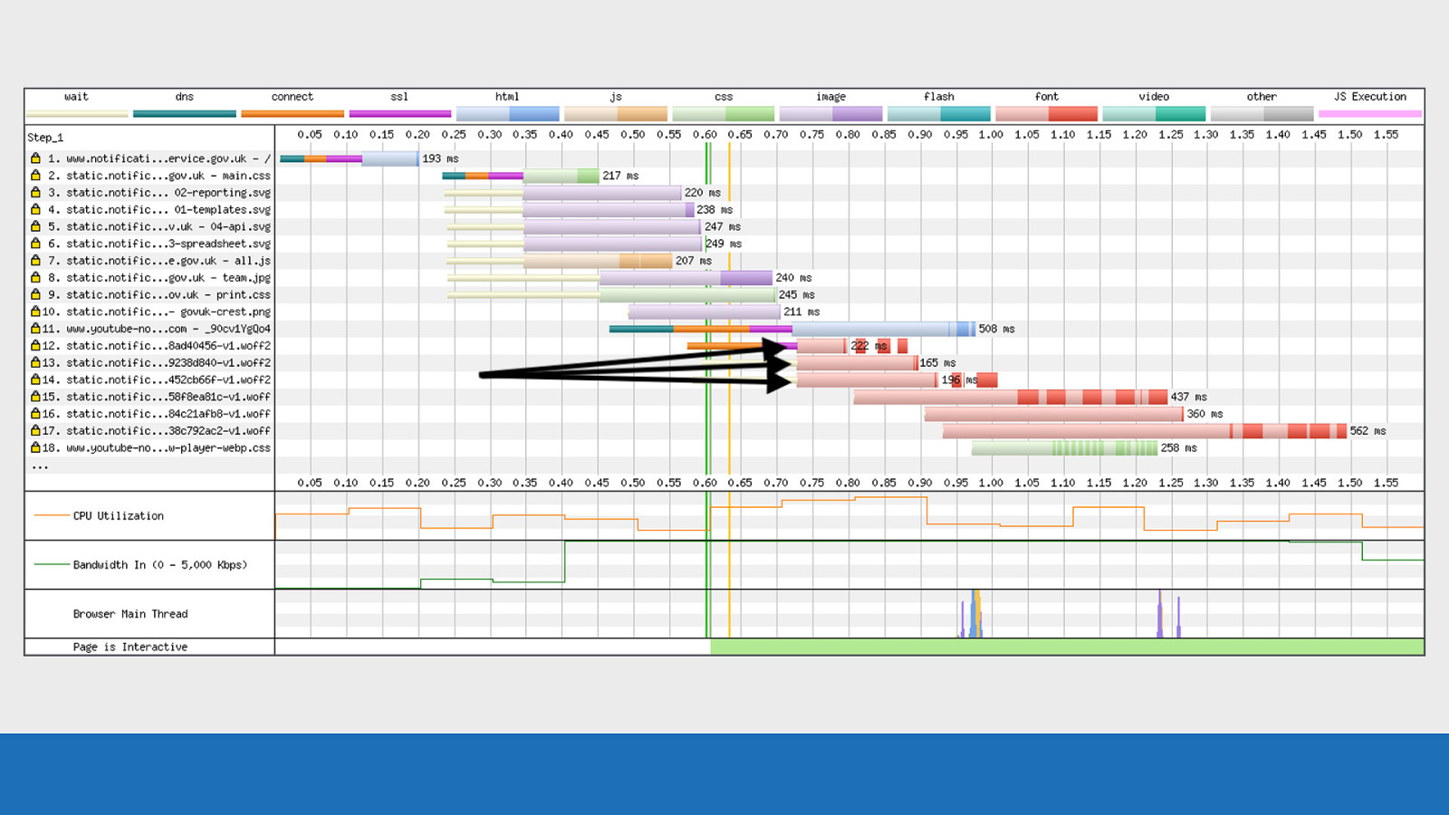
GDS Browser immediately cancels the request, this is seen in the waterfall by the light red colour disappearing. (Zoom in) [CMD+alt+8]
Slide 111
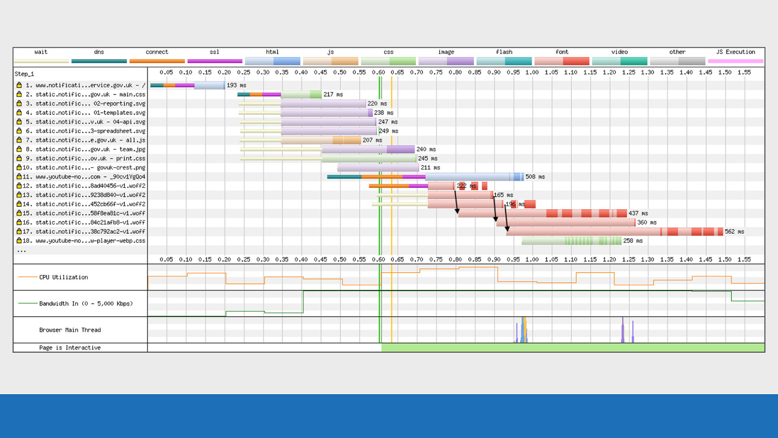
GDS Almost immediately after this happens the browser makes a request to the ‘fallback’ WOFF versions of the fonts. This then doubles up the number of font requests and increases the bytes being sent to the browser.
Slide 112
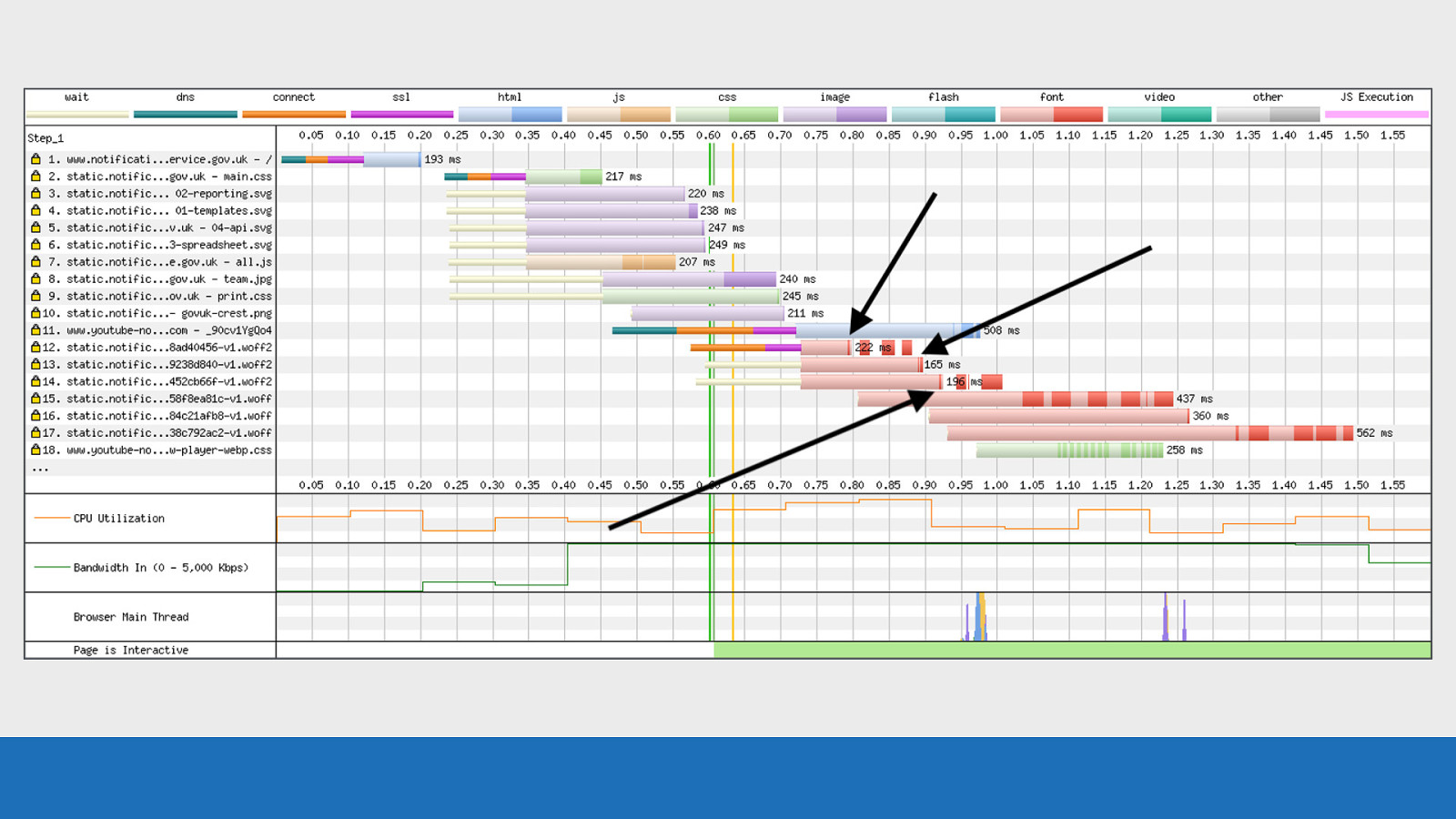
GDS The dark red patches that now look to be floating is likely to be data that was already in one of the various buffers between the server and the browser and already in transit, so couldn’t be cancelled. This is just an example of how much information we can get from a waterfall chart once we understand some of the internals. Without SpeedCurve and WebPageTest this would have almost been impossible to identify and fix.
Slide 113

More information As we’re coming to the end of the talk, you may be asking “where can I go if I want to find out more information?”
Slide 114
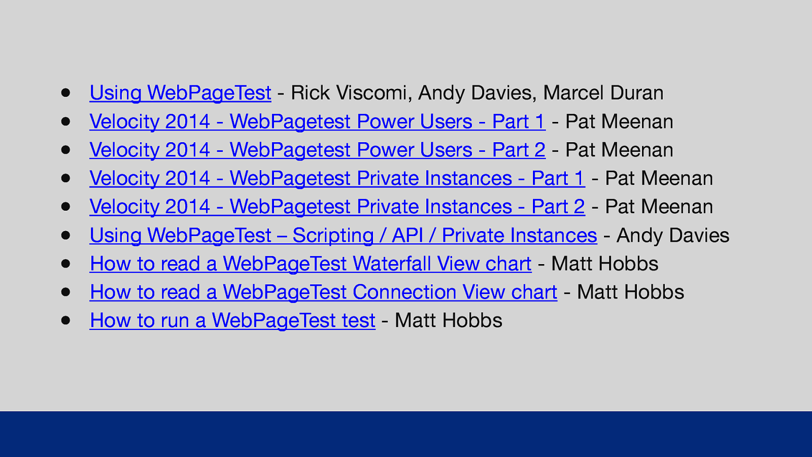
● ● ● ● ● ● ● ● ● Using WebPageTest - Rick Viscomi, Andy Davies, Marcel Duran Velocity 2014 - WebPagetest Power Users - Part 1 - Pat Meenan Velocity 2014 - WebPagetest Power Users - Part 2 - Pat Meenan Velocity 2014 - WebPagetest Private Instances - Part 1 - Pat Meenan Velocity 2014 - WebPagetest Private Instances - Part 2 - Pat Meenan Using WebPageTest – Scripting / API / Priva e Instances - Andy Davies How to read a WebPageTest Waterfall View chart - Matt Hobbs How to read a WebPageTest Connection View chart - Matt Hobbs How to run a WebPageTest test - Matt Hobbs GDS Here’s a list of links to various resources if you want to find out more about WebPageTest. Some shameless plugs in there from me, as well as talks from Pat Meenan and Andy Davies. t I’ll share these slides after the talk.
Slide 115

Thank You’s So this talk is based on a blog post I’ve written called: “How to read a WebPageTest waterfall chart” I did the research and pulled the information together for this post, but I’ve had lots of input from folks in the web performance community with corrections, additions, and general advice.
Slide 116
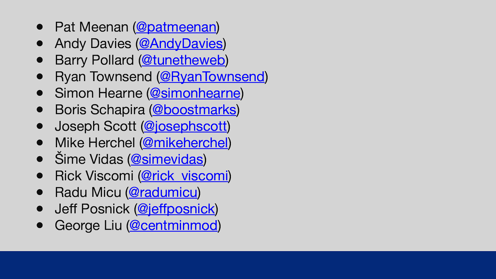
● ● ● ● ● ● ● ● ● ● ● ● ● Pat Meenan (@patmeenan) Andy Davies (@AndyDavies) Barry Pollard (@tunetheweb) Ryan Townsend (@RyanTownsend) Simon Hearne (@simonhearne) Boris Schapira (@boostmarks) Joseph Scott (@josephscott) Mike Herchel (@mikeherchel) Šime Vidas (@simevidas) Rick Viscomi (@rick_viscomi) Radu Micu (@radumicu) Jeff Posnick (@jeffposnick) George Liu (@centminmod) GDS So a big thank you to all these lovely folks. All their Twitters are listed, they are worth a follow if you don’t already!
Slide 117
Thanks for listening! Matt Hobbs Twitter: @TheRealNooshu Hope you found this talk useful, thanks for listening!
Slide 118

Q&A If we have time left, I’m more than happy to try to answer any questions you may have.